Brand Process: Logo Design Outtakes

April 23, 2013

IHODShop-logos

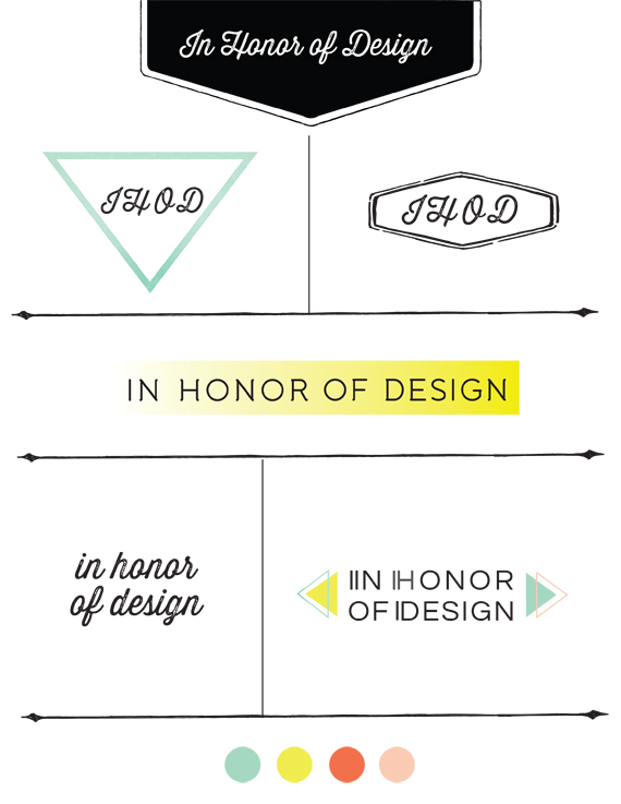
Designing your own logo is by far the most challenging. I love tackling branding projects, but when it comes to my own, I can never stick with a decision. This is why I switch it up almost every year! I consulted my sisters on this one, and am so thankful for their fresh perspective.

Here are some of the examples from my design board that worked together to inspire the new one. I will be using the top left for my portfolio and possibly business cards. I was intending on going completely black and white since the posts usually contain a good deal of color, but I couldn’t quite pull away from color altogether:) The colors above will be used interchangeable in different brand pieces. So what do you all think?? Would love to hear which of these caught your eye!

*View the black and white inspiration board for the brand re-design here.

Leave a Comment

  • I love black and white with a pop of color. I’m glad you kept your colors, they are so you! I really like the idea of switching between the four for projects. Can’t wait to see more as your rebranding develops. Good luck!

  • […] Why I changed the IHOD logo: Just like I outgrew blogger, I kind of outgrew the old logo as well. I debated whether to keep the new logo somewhat similar to the old, but it was fun to have a fresh new start and design without trying to fit a mold. I needed a design that would have some versatile options for some upcoming project sites as well. You can view the logo process designs in this post. […]

  • […] Wow- I’ve been so excited about the launch for IHOD that I could barely keep my mouth zipped! Anna and I have been working together to give her brand and blog a beautiful new look. It’s lovely, isn’t it? (I can’t take all the credit for this one- you can see more about Anna’s logo here.) […]

  • The arrows and the palette with the white and pops of sherbet looking colors is energetic and fashion forward.

    I love your logo, it’s fab!

  • i love the font you chose and although i liked the color pastel pallet you were working with, the mint triangle is my fav… way to go! what a fun project, you did a great job!

  • Thanks for sharing this 🙂
    Congrats on the new design. I am having a little bit hard time with the posts coming up as thumbnails after the few latest and I’m not that great into navigating without the standard post layout, but I’m gonna get used to it soon 😉
    I love the actual blog header logo, but I also love the bottom left. If you added the green/mint triangle on the background of the type it would look great on the blog too. Love the idea of using different ones for different purposes though. I always used to do this as I couldn’t decide and I felt strange. Glad to see other people doing it on purpose too 🙂
    Have a bright week Anna!

  • […] | Blog Tip – Trends + Exclusive Content IHOD | Brand Process A Cup of Jo | Three Ways to Arrange Flowers RELEVANT | Why don’t Christians […]

Copyright © 2024 In Honor Of Design powered by chloédigital