The kitchen has always been the place I consider the heart of the home. Growing up, we spent hours in my grandmother’s small kitchen around her table as it seemed she would multiply the loaves and fishes from a few tortillas and feed the masses. She wasn’t just feeding us, but providing a place we always knew would find welcome. It was the same in my own home, where I would spend many hours around the table for family dinners. So much life happened in those kitchens! I hope the same for all who walk through ours. That they feel welcome, loved, and appreciated. With this goal in mind, here are a few elements we are going to aim for as we start the kitchen reno process…
{source}
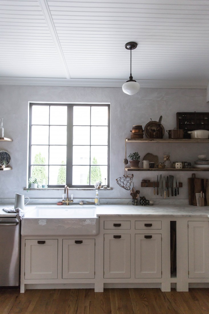
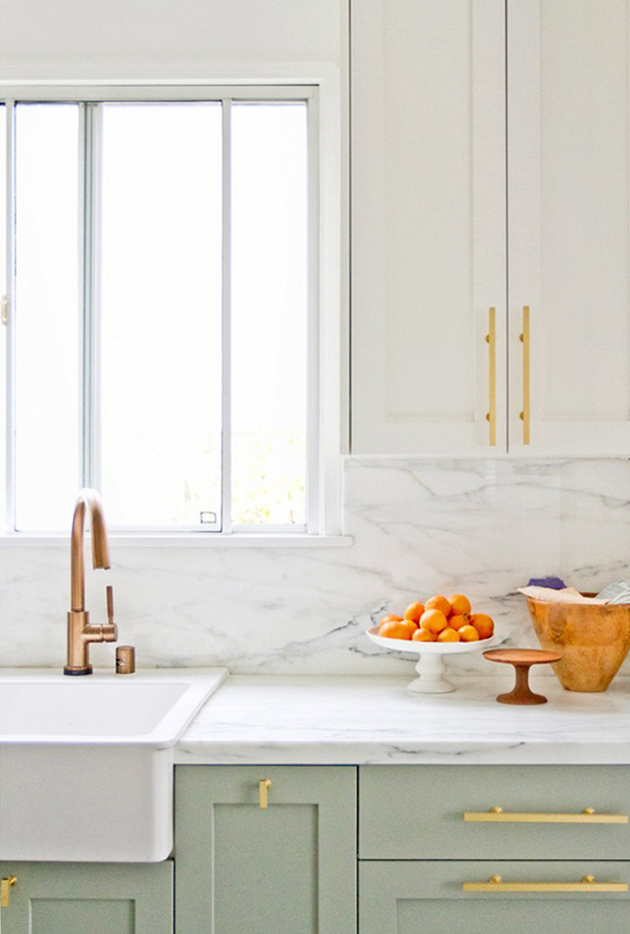
1.Colors – White is dreamy, but not quite something I want to be srubbing down every 2.5 seconds for the next ten years. I am really drawn to these tones and colors for countertops, cabinets, wall space, etc. A lighter grey may still show wear but it’s a little easier to work with and compliments just about every color in the book.
{source}
2. Brick – I’ll never get it out of my system, so might as well yield to it! Every time I have been to NYC, I want to take home the brick walled apartments in my suitcase. We are going with a lighter color in both the brick and mortar like this grey washed wall. I will be seeking the help of brilliant wall artist Emily Pope Harris.
{source}
3. Cabinets – Considering handles and finishes are the easiest thing to swap in and out over the years without spending a pretty penny, this is one of the elements I would like to keep on the modern side. Without replacing the cabinets altogether (which is the most costly aspect of a kitchen next to countertops) we are going to change the doors to either double narrow fronts or glass. I love the combination of a narrow cabinet door with a tall sleek handle.
{source}
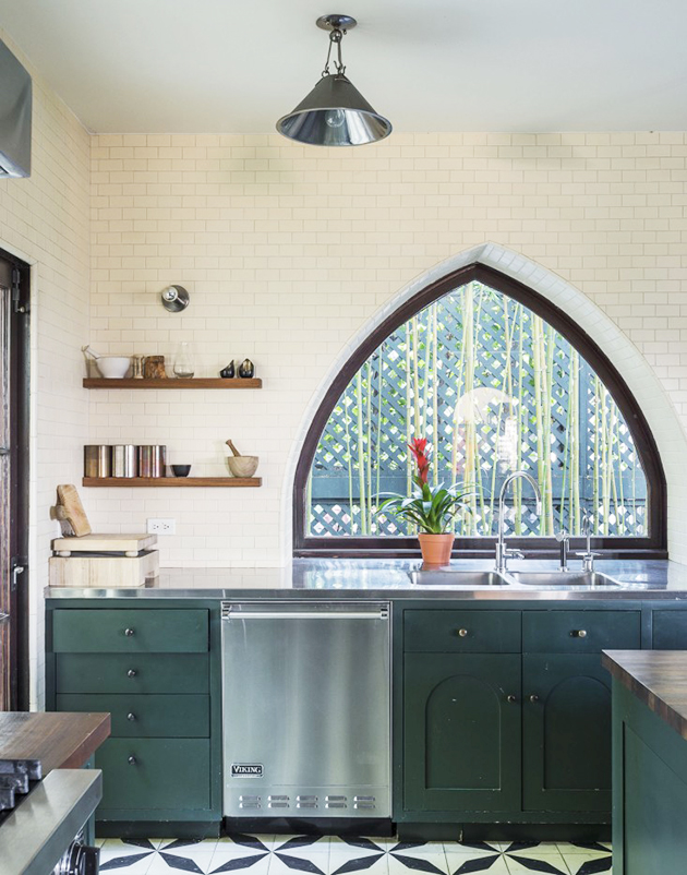
4. Arches – Custom window shapes can completely change the look and feel of a space. Since the goal is to have some European elements throughout the home, an arched window would be pretty dreamy. The frame on this one is so unique!
{source}
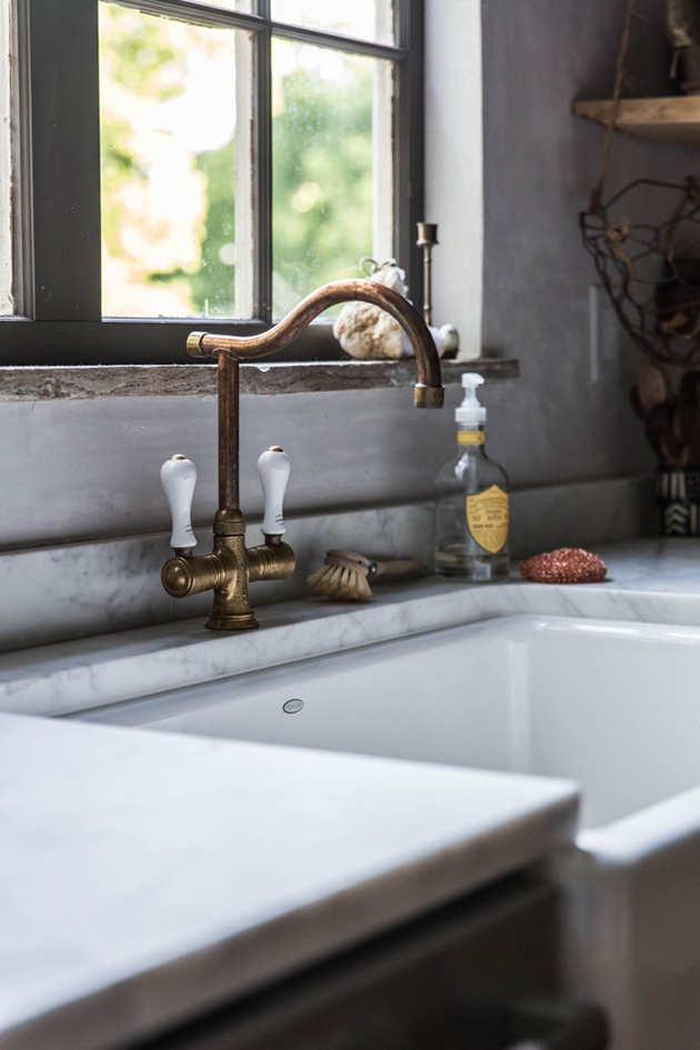
5. Faucet and Sink – Oh my lawdy this faucet gives me the goosebumps! Swoon. Go ahead and check out the rest of Beth Kirby’s kitchen. You won’t regret the drool that will form a puddle below your jaw. Something so simple as a faucet can offer so much character to a kitchen. The copper with grey marble combination is a match made in heaven. If anything were to lure me to do dishes, it would be a curvy faucet. Ok I’m done….moving on now.

{source}
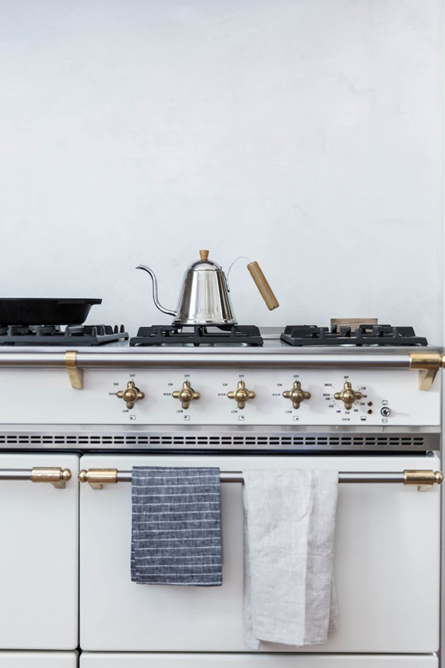
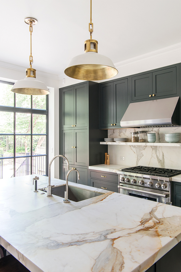
6. Finials – Well shoot. Did you ever think a stove could be so attractive. I’m ruined. Brass finials have done me over!
{source}
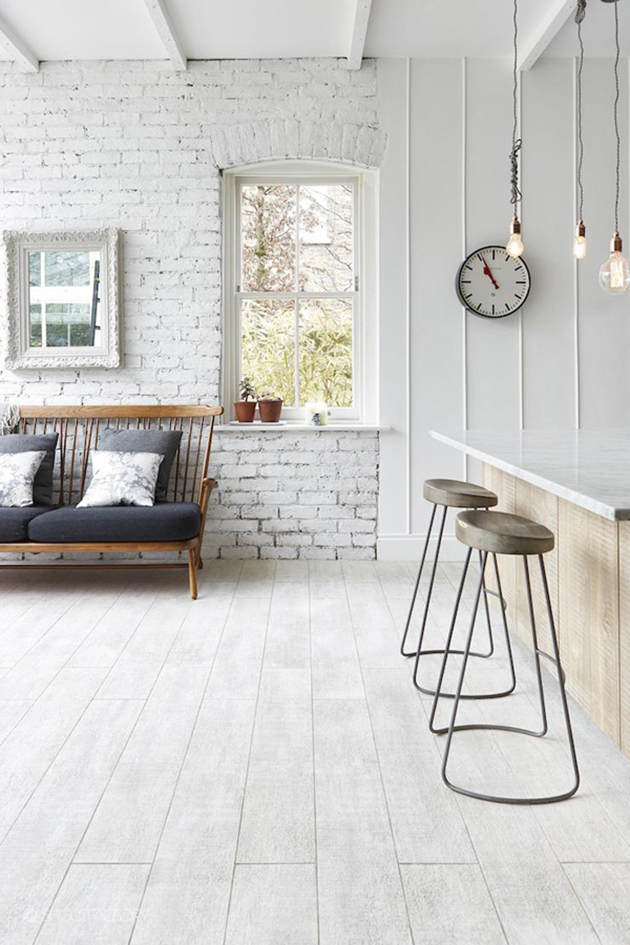
7. Lighting – Hanging pendants over our island makes the most sense for offering a good light source and visual balance. I am currently hunting for similar ones to the above in different colors. The hunt is all part of the fun!
I’ve started a kitchen pinterest board to organize some thoughts, but I always feel the need to have the visuals right in front of me before making decisions. I’ll share that part of the process soon.
At the end of the day, I am just thankful for running water and working dishwasher! I consider them both luxuries.
Happy weekend folks!

