
(source)
We have a couple home projects underway, and one of them is a multi-purpose room in our daylight basement. Since we are going to be using the space for an office area, school desk area, and even a makeshift guest room when we need it, I started thinking about what I want the room to feel like for everyone who will use it. You have probably heard that paint colors can effect our psychology and emotions in different ways! For instance, colors can contribute to lifting our spirits, helping us feel calm, and even lower our blood pressure! My mother in law of Pillar Design works on dental office designs, and has told me how important it is for her to choose colors that can help patients relax. (Because raise your hand if you anxiety levels rise when walking into a dental office.) I find it fascinating, so I thought it would be fun to share a brief run down of the color spectrum and the psychological effects these paint colors can have.
(source)
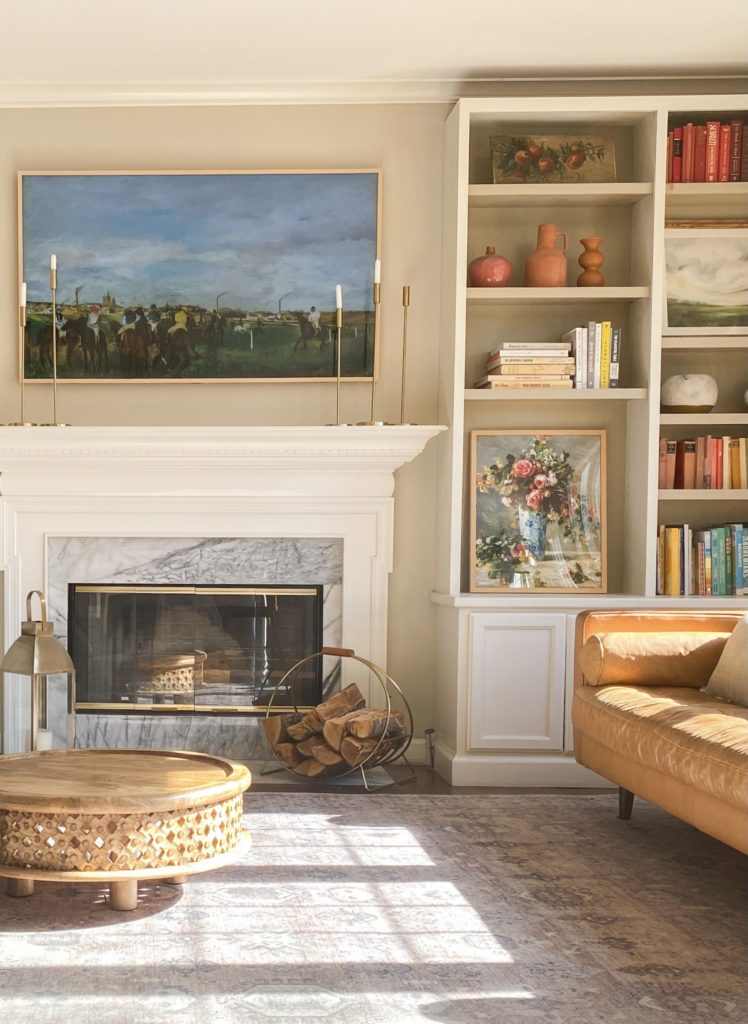
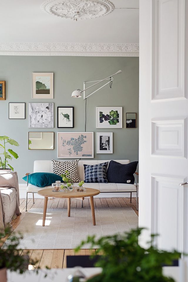
Blues + Greens – Good for rooms where you spend a lot of time. Serene, peaceful, and lowers respiration and blood pressure. There is actually scientific login behind this – because the eye focuses the color green directly on the retina, it is said to be less strainful on your eye muscles.
Rooms: Living, dining, office, or bedrooms.
(via Apartment Therapy)
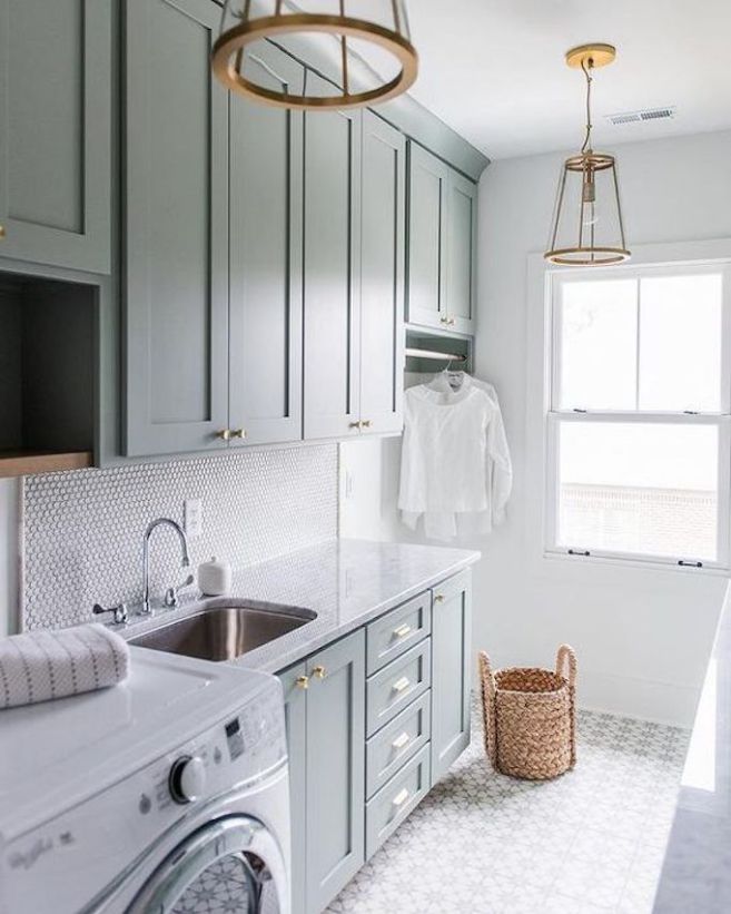
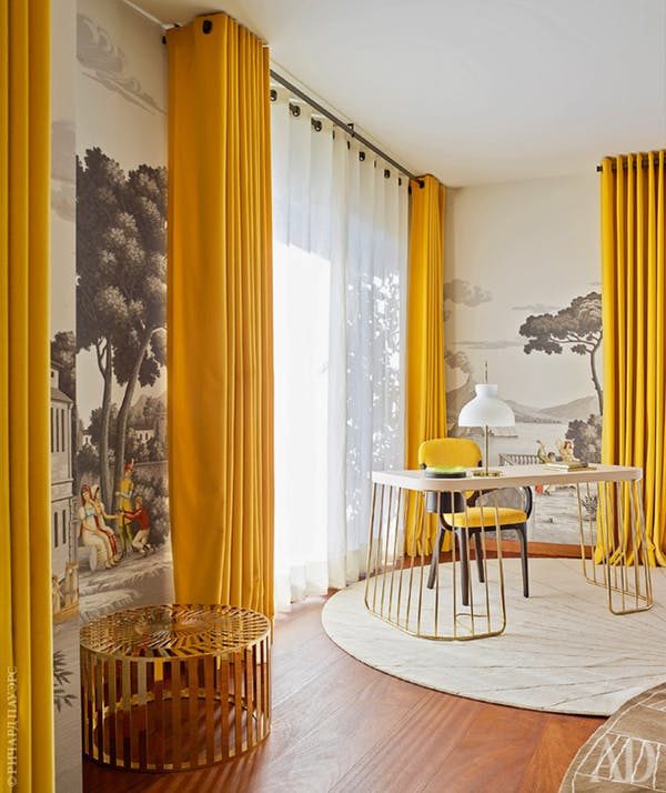
Yellows – Associated with happiness and joy. Stimulates mental activity and muscle energy. If too rich it can feel over stimulating. (It’s proven that babies tend to cry more in yellow rooms!)
Rooms: Screened in porch, bathroom, laundry room, or kitchen.
(source)
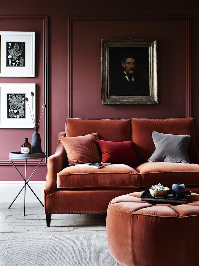
Reds – This color can increase energy levels, but also increase blood pressure and heart rate. It can be a little over stimulating for bedrooms, but if it is used in a room you are in after dark with low light it can be an elegant tone!
Rooms: Library or side rooms.
(room by Emily Henderson.)
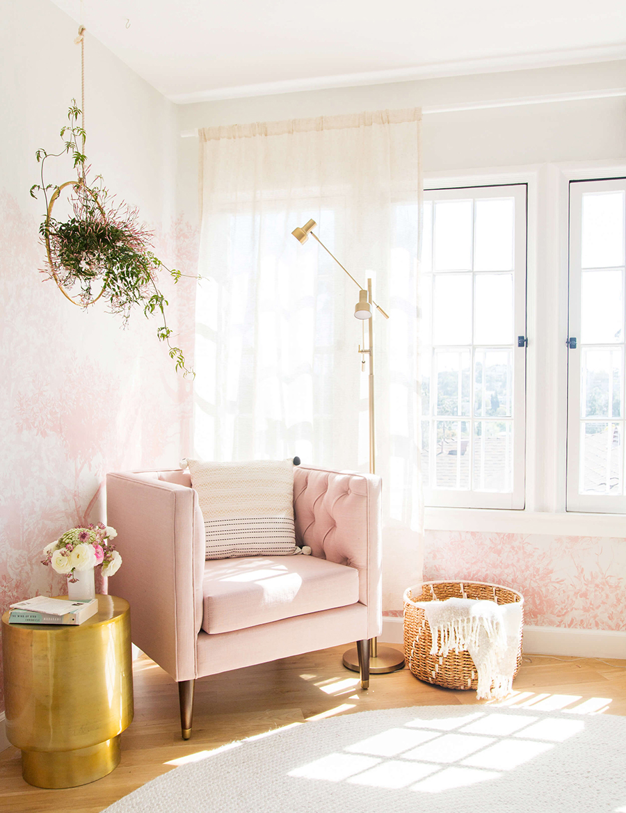
Pinks – Inspires creativity, imagination, and balance. The bold shades of pink could be a bit overwhelming for some in a room setting, but it does tend to encourage more positive emotions.
Rooms: Bedroom or work space.
Lavender/purples – Promotes creativity, and gets your brain synapses firing. In the cool color family, it can give way to a more serene, peaceful, and tension releasing setting.
Rooms: Bedroom, common living or creative areas.
(via Wit and Delight)
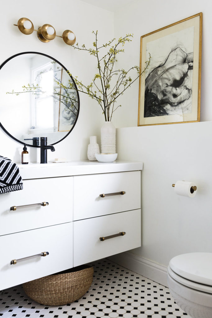
Whites – Promotes feelings of cleanliness, order, safety, and light. When applied to spaces, it visually enlarges.
Rooms: Works for any room in the home or office space.
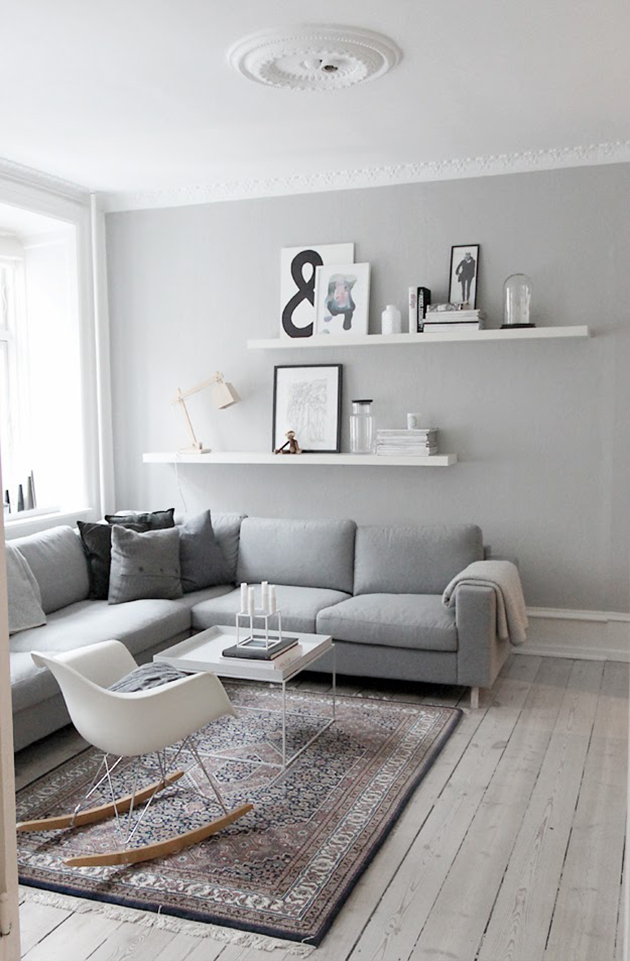
(source)
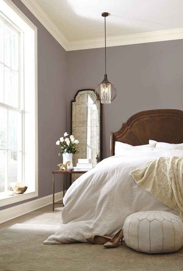
Greys – Neutral, practical, and timeless, but it can also offer a lack of creativity and energy.
Rooms: Common areas or bedrooms.
The psychology of color is something that has been studied for many years now, and you probably have been a subject of it more often than you think! (You might notice food companies advertise in warm colors because they tend to make us hungry.) I studied color theory in college, which probably influenced more of my home design choices than I realize!
Which of these color rooms draws you in? What’s your spirit color so to speak? 😉