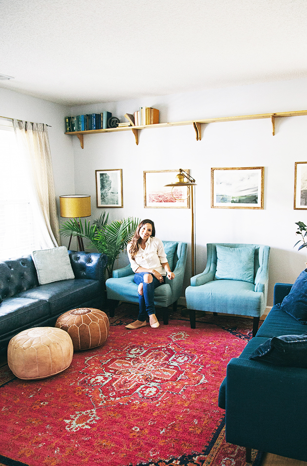
Alas! After months of buying and returning pillows (wink), we have finally finished our living room makeover. Just in time for me to get the re-arranging fever all over again. Kidding….maybe.
I can’t wait to share all the details over the next few weeks, but for today, here are the before and after pics! It is incredible what a fresh space can do for your whole family. It has cleared up some mental clutter and become a favorite place to hang for our family. Gabe is particularly fond of the old school feel news reading nook it provides him. I am thankful for the ample couch space for naps;) We basically just had the basics in this room for the last few years. You may remember the last update…
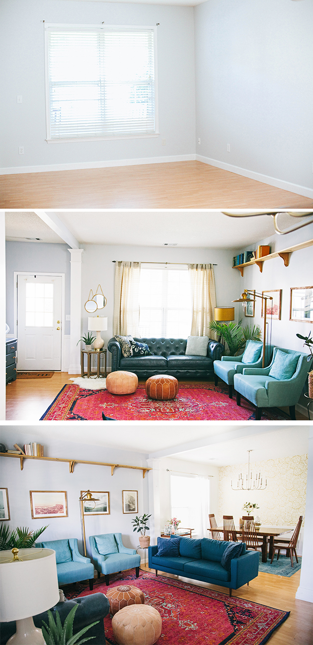
Our goals for the space: We wanted a room that felt conversational and inviting. We could have left out the second sofa for a more open layout, but the facing couches has already provided some great hang out sessions with friends and family. I also was aiming to combine both Gabe and I’s styles so it is a mix of bohemian, traditional, and a splash of modern. We also wanted it very family friendly so the kids could go about their usual antics and not break or bust anything;) So far so good!
So lets get to the breakdown of the space overhaul:
I started with the rug and couches since they would be the focal points of the room. The rug is from Rugs USA (tons of options at super discounted prices). I wanted something bold that coincided with the dining room rug next to it, as well as a bohemian edge. This one nailed it.
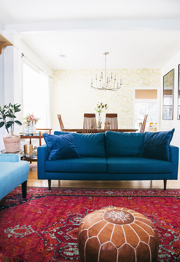
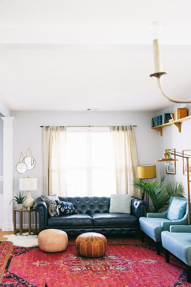
COMFORTABLE couches that offered a traditional feel with a modern edge….hard to find but thankfully Home Decorators Collection came through with the tufted navy sofa. The peacock blue sofa is from All Modern. It plays off the dining room rug as well. (A post on finding the right couch for your space coming soon!) I found the most affordable option for reading chairs on Amazon! I pulled the mint/aqua color from the rug to give a lighter accent to the heavier blues.
Next we chose the paint color and I used two tones of Grey (Valspar’s Polar Star + Gravity). I wanted the subtle two tone effect in the entry way and living room. Since we rent our home, we can’t do much when it comes to wall treatment, but a fresh coat of paint can lift shadows and bring in light like nothing else!
Like many rental homes, the lighting options were nill, and left much to be desired. I turned to Birch Lane for that rescue! I mean, how about those floor lamps?! To add some dimension to the room Gabe made the custom shelf (DIY and will share that soon as well).
Since the colors of the room were already bold, I kept the artwork at minimum with a clean straight line of favorite landscape prints from Minted. Since they offer framed artwork, I chose the wooden frame edges to coincide with the shelf unit.
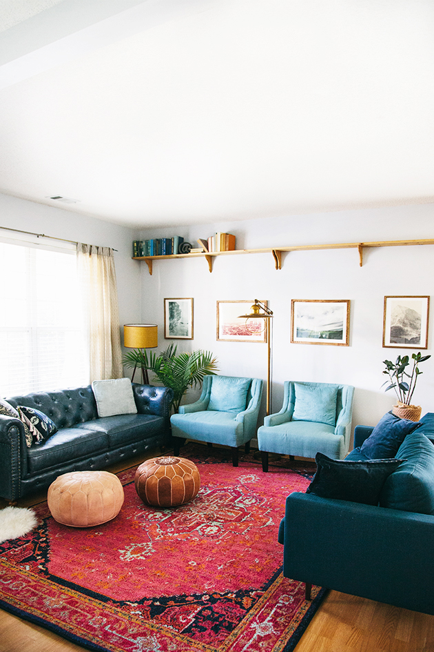
I usually prefer no curtains in a room to allow as much natural light as possible, but I found a light neutral pattern that worked with the space from West Elm. The fun part is adding in the last details of decor. Coffee tables are a hazard for my adventurous little ones, so we went for the morrocan leather poufs as an alternative (and kid friendly) option.
The rest of the details:
End Table & Lamp: Lulu & Georgia
Pillows: West Elm , Anthropologie, Lulu & Georgia
Circle hanging Mirrors: DIY here
Sheepskin: Lulu & Georgia
Aloe Plant: Target
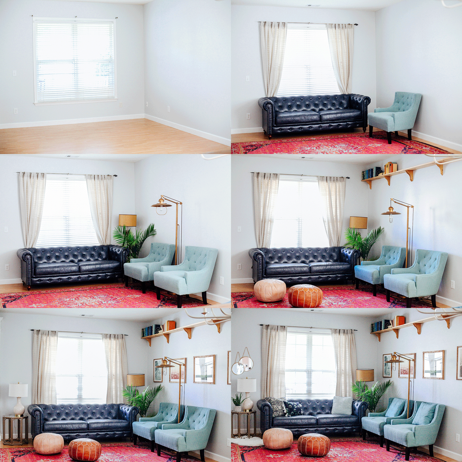
I don’t think Gabe and I realized how much we loved getting into home projects till this year. Sometimes it takes a while to make a house a home, but it has been worth the wait. Hope you all have a grand weekend! Here’s a gif of the step by step process!
A huge thanks to Chelsey Heidorn for the photos!

