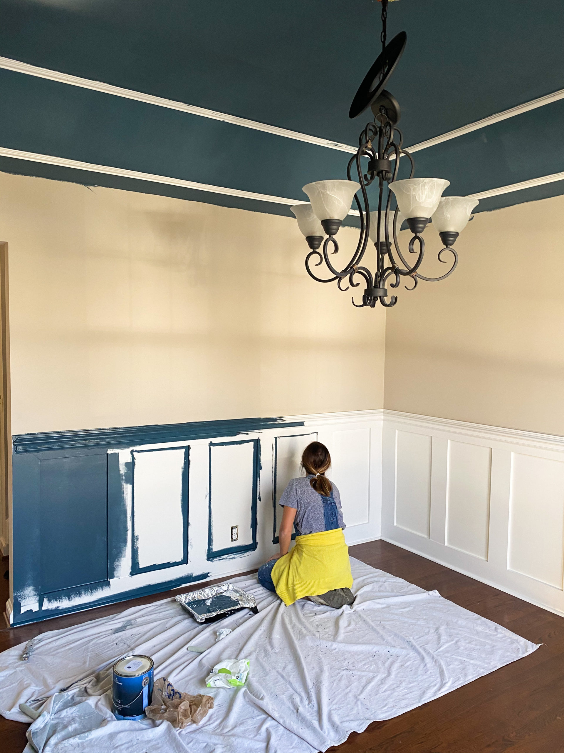
We started the dining room renovation today, and this will be a room with some bold color and pattern. I am going back to my roots! I have always loved color, and somewhere along the way (probably the influence of white walled everything on instagram) I stuck with safer colors. White can serve a purpose to make spaces feel big and open, and I still love that. However, since this is a more closed off space, it felt like a great opportunity to go for it.
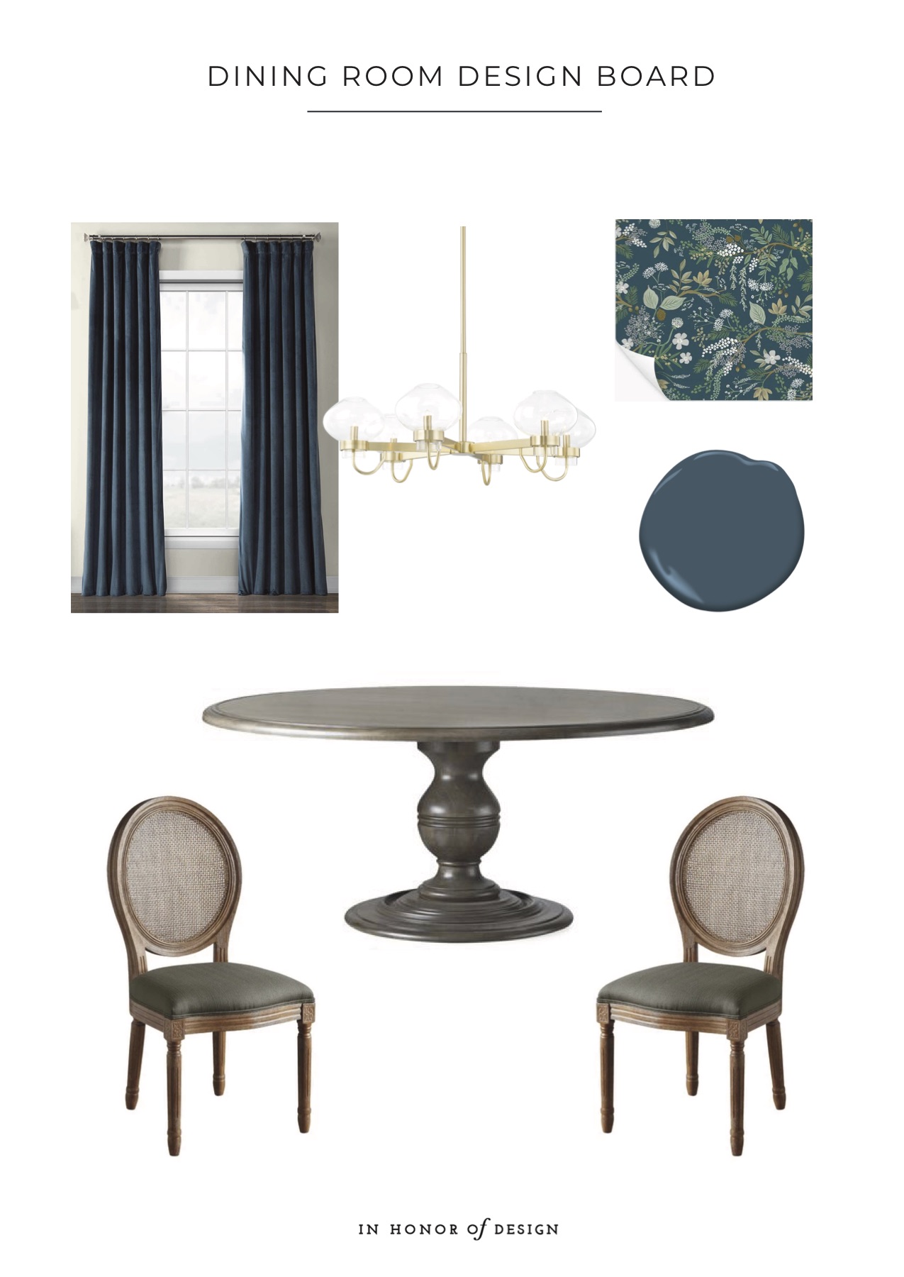
Wallpaper – c/o I was smitten for this pattern, and basically designed the whole room around it. I ordered several samples before deciding, and this one just looked too good in person.
Paint – I took the wallpaper sample to Ace Hardware to find a color as close as possible to the blue base. ‘In the Midnight Hour’ by Benjamin Moore was as close as they come. Ace Hardware carries both Benjamin Moore and Magnolia paint samples so it’s been easier for me to try those lines out in our home. I love the rich hues I find in the Benjamin Moore paint line, and Gabe swears by their quality. It goes on thicker and smoother.
Round Table – We found a local carpenter who is creating a custom round family style table for us. Standard 60″ size was not quite big enough for our large crew, so I was so excited to find someone who can make a 72 in. I know it will contribute to many family meals, and hopefully as they grow actual conversations vs. convincing toddlers to eat their vegetables.
Lighting – I didn’t want a light fixture that was too formal, but needed at least a few bulbs to light up the room. I really like this option from Hudson Valley Lighting.
Cane back chairs – I found a set of 8 cane back vintage chairs on facebook marketplace for $200. Couldn’t believe it. Depending on the table stain color I may have to paint them. If not, I will just be reupholstering the seat covers. At first I thought the caning furniture was a trend, but my parents even had it, so it’s looking to be a pretty timeless trend.
Curtains – We removed the wooden shutters in here (which are beautiful, but they do block a lot of natural light), and will be replacing with pull down blinds and curtains as options for privacy. The tricky part will be finding the right color! This set seems to be a match, but velvet is not ideal with kids! Yikes.
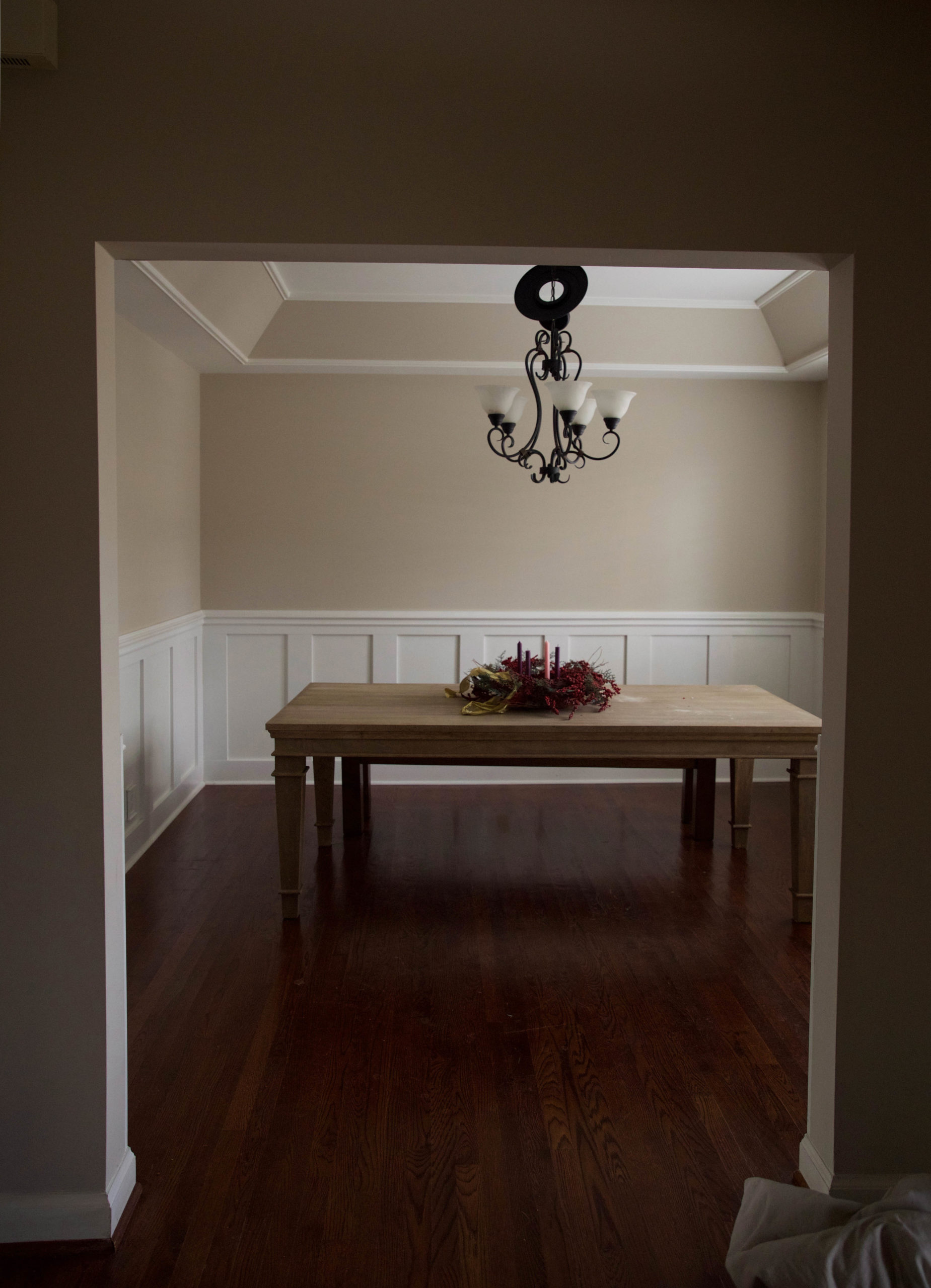
Let’s have a good look at the before pictures so you can get a better idea of where this is going!
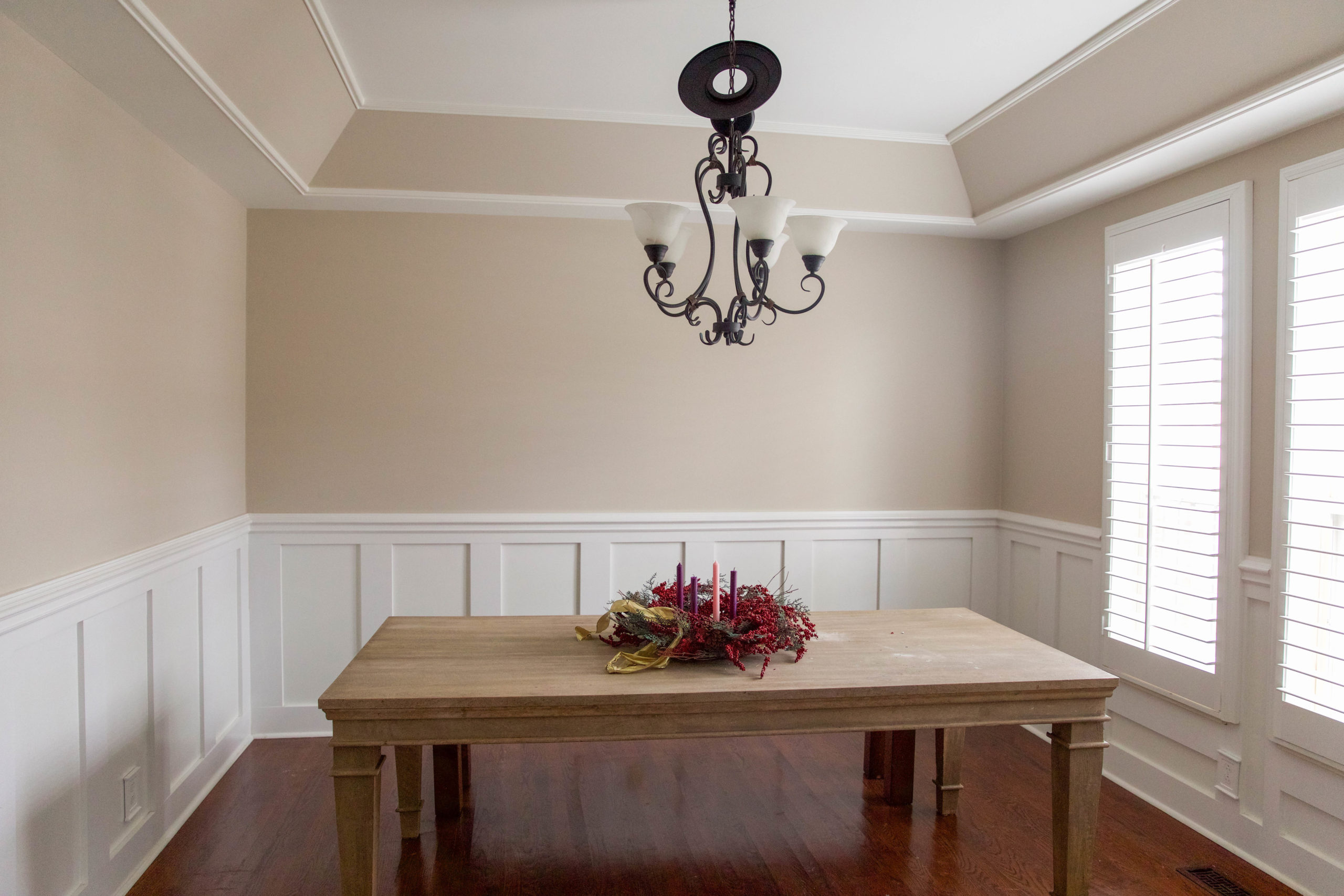
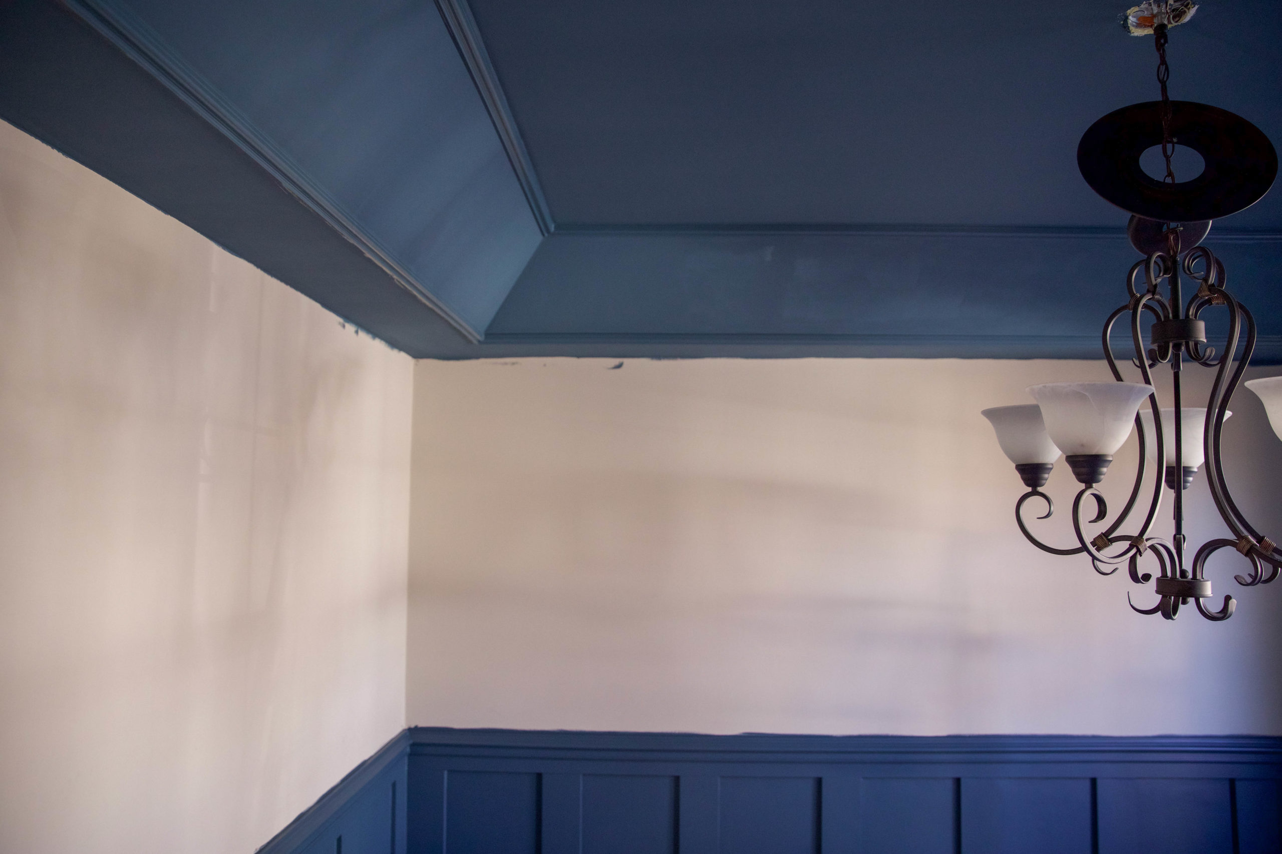
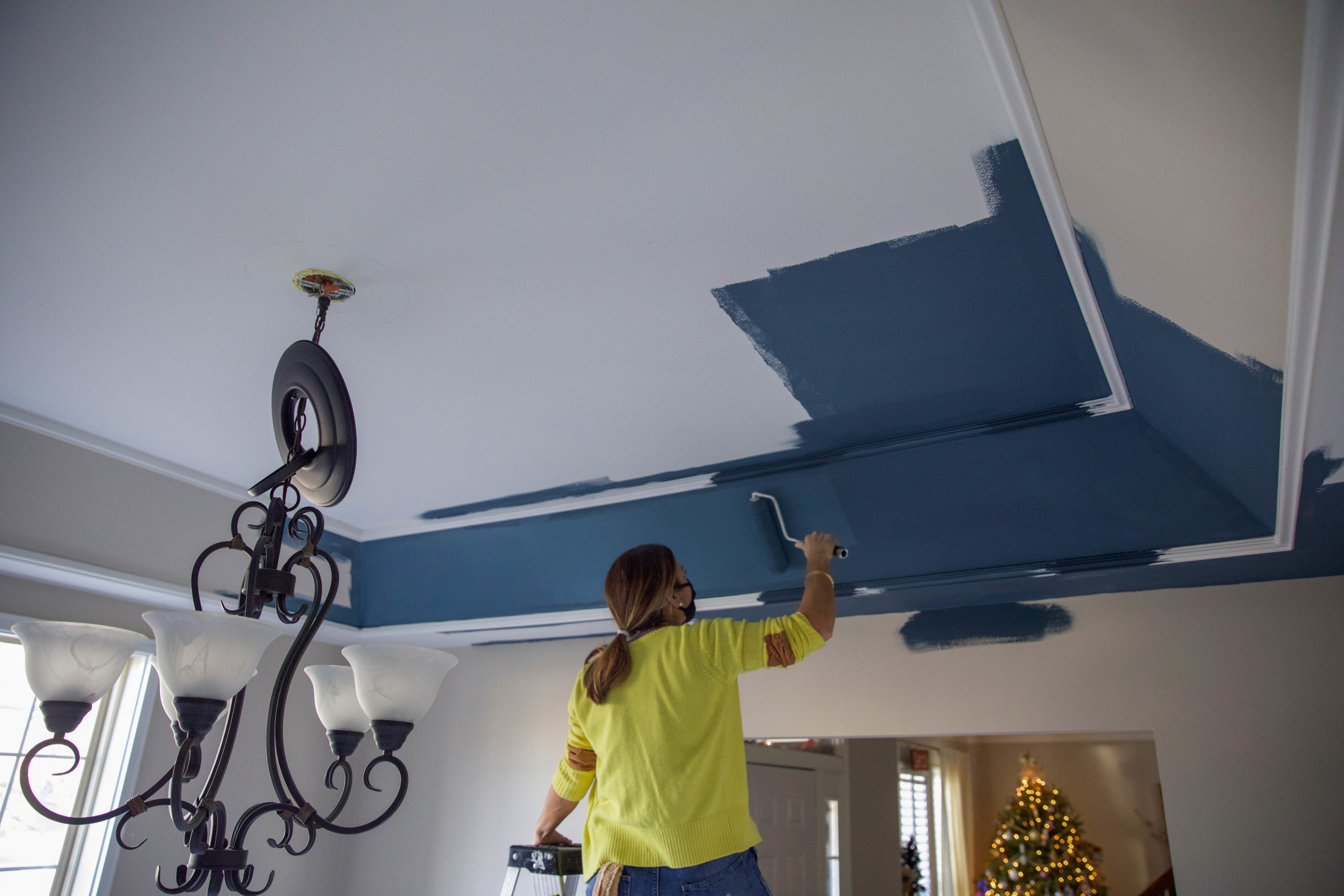
(We sampled both hues on the ceiling before beginning!)
We asked my cousin if her paint company could help us out with this project since we have a lot on our plate right now. They are wrapping it up pretty quick!
Paint trick – Some stores will allow you to get a color in less saturation. I like to ask for 50% color reduction for ceilings. The reason being lighting can make a paint hue appear darker or lighter based on where in the room. The ceiling gets minimal direct light and looks more shadowed. When we use the same color in 50% less color, most of the time it ends up looking the same as the walls beneath it due to lighting. Granted, make sure you get the color reduction done at the same store (and honestly – with the same employee) you order your paint or the formulas could be different. Learned this the hard way.
Looking forward to sharing the outcome with you! We will be sharing the progress on instagram stories, and if you have any questions about this space, drop them below!

