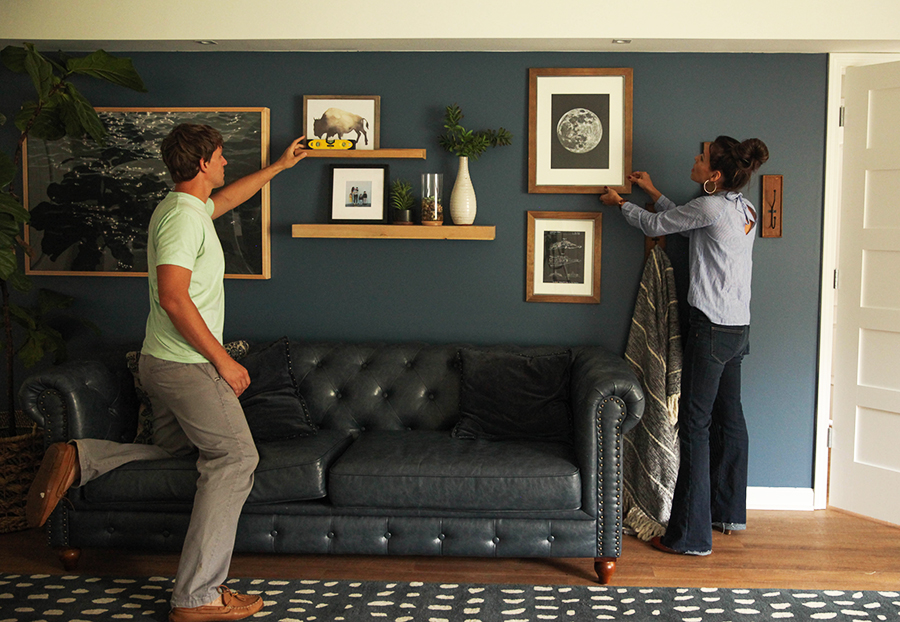
It’s been over a year since we started design concepts for our basement space, and the boys’ room was our main motivation to make it happen! They were itching for a little room to stretch. We designed this space with the goal of making it a place that was both functional and peaceful so that they would enjoy spending time there. I couldn’t wait to add some color, so several paint swatches later, we chose Pratt and Lambert’s Accolade Interior Premium Paint & Primer in their 2018 Color of the Year, Heron (27-18).
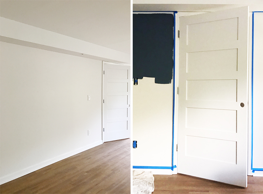
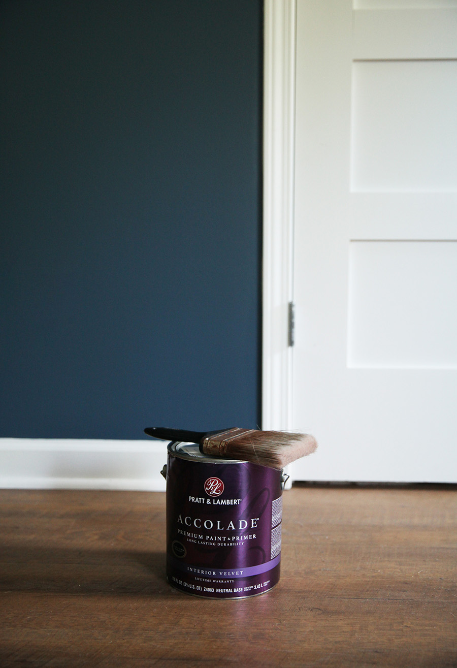
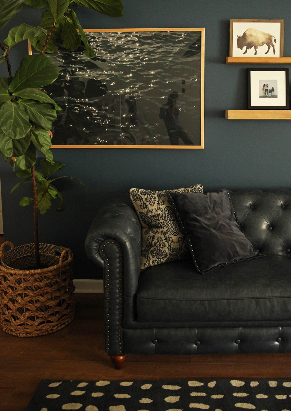
When I saw this color, I knew it was exactly the hue I had been looking for that would tie together the tones we already had going in the space. It is a more sophisticated hue of blue that is super versatile with the type of style you are working with. Thinking through my boys’ personalities and interests, we decided to put the sofa that used to be in our living room against this wall to encourage a reading nook. They love books, animals, Star Wars, construction, art, planets, and superheroes. We will be putting bookshelves on the other side of the room, so we turned this space into a cozy area where all cool kids can hang….including mom and dad, if they let us.
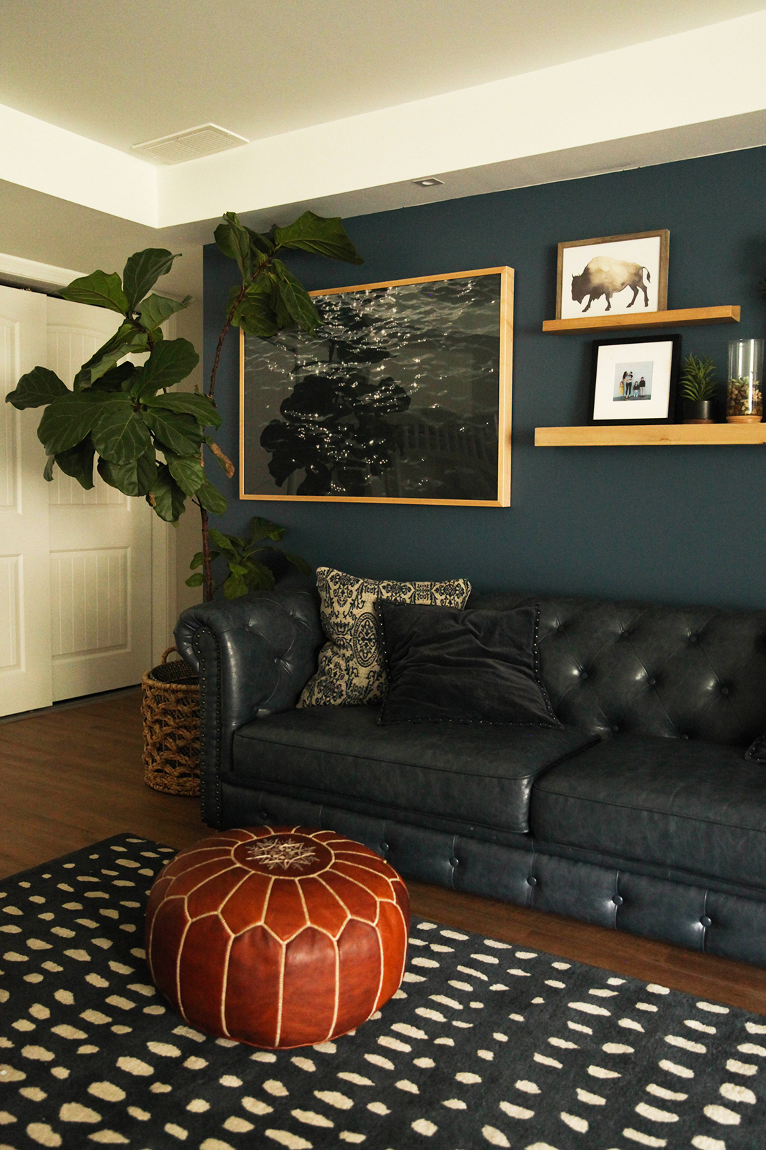
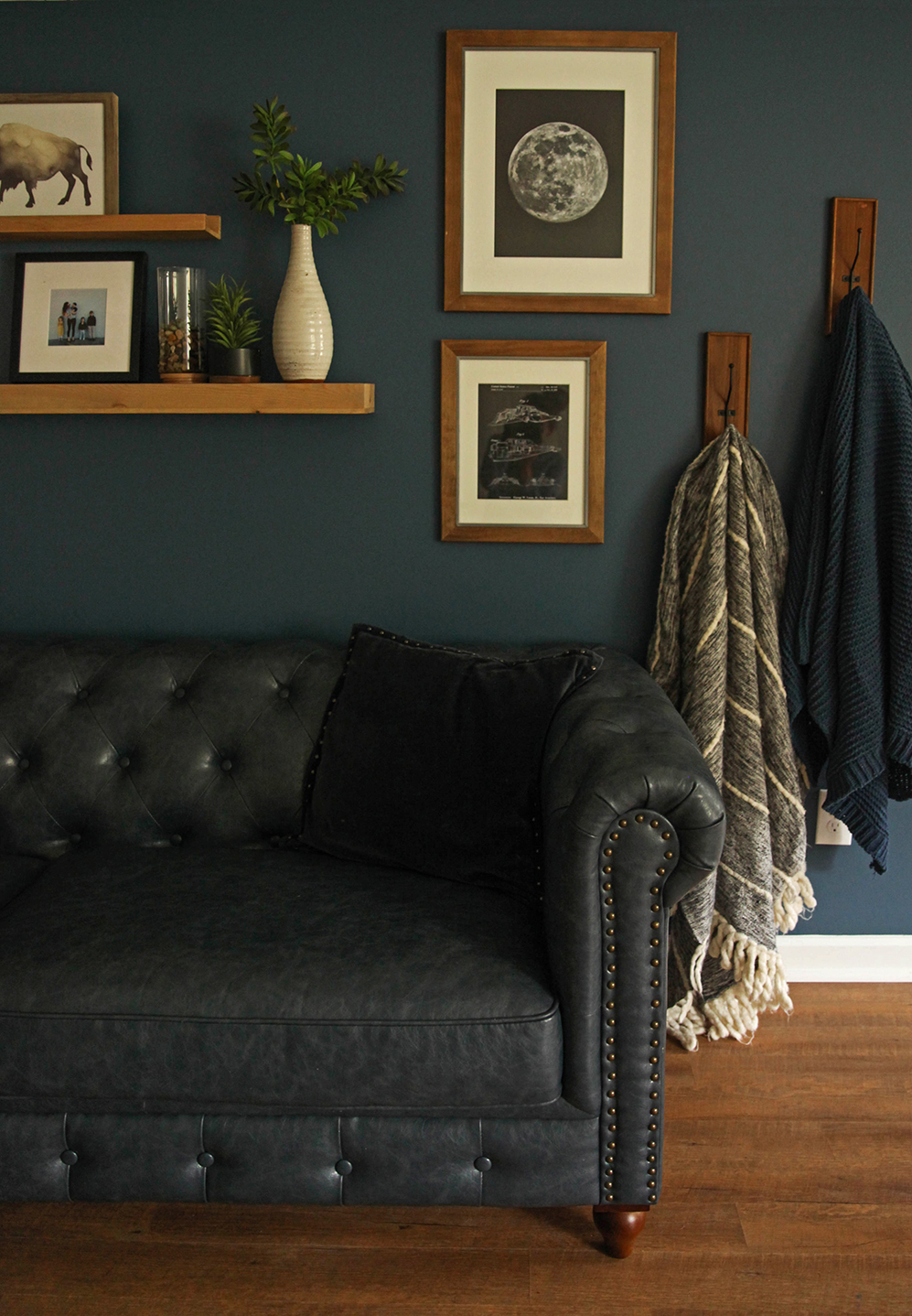
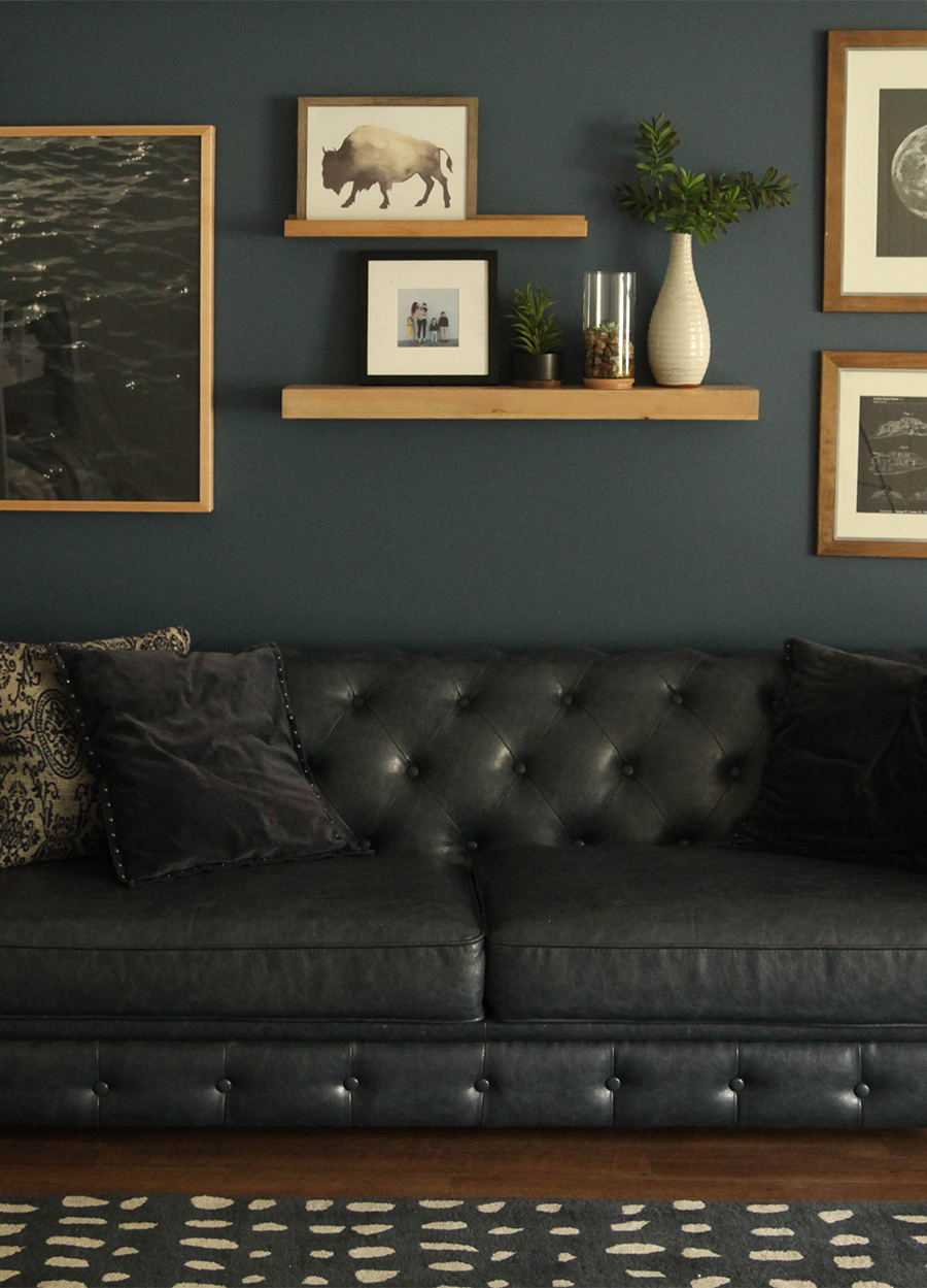
I pulled design inspiration from Pratt & Lambert’s color forecast Beyond, which consists of four color trend stories: Diverge, Boundless, Synthesize and Intention. The color forecast and color of the year are selected by Pratt & Lambert’s color and design experts. Since we were looking to create a space that was a step away from distractions and media, we selected the color Heron (27-18) from the Intention trend story. The color palette of Intention was created to bring a more calm and mindful vibe to any room of the home, so it I love that it reflected the goals of the space. We used an eggshell finish for a more matte look.
Another design aspect featured in Intention is greenery. You might have noticed the plant life we put in almost every room in our home. That is because I think it brings so much peace to a space, and makes a room feel more inviting. I am so happy this room can be a little retreat for them.

We will share the rest of the boys’ room soon! I wouldn’t mind using this Heron blue paint in my own room now. There is something so serene about it. Have you tried a bold color in your home? If a full room is too much a commitment for you, try just a wall! You will be surprised how much character it can contribute.
Here is a time lapse video we made compressing the span of the design process over a few days time down to one minute! If you like these type of videos, subscribe to on YouTube so we know to make more!
Items featured: Pratt and Lambert Paint in Heron (27-18), Tufted sofa (former living room sofa), Boho dots rug, fiddle leaf fig tree (faux version), basket planter, Max Wanger Mediterranean print, picture ledge shelf, float shelf, buffalo print, framebridge family photo, moon print (made using a graphic), Star Wars ships print, frames, throw, velvet pillows.
*This post is sponsored by Pratt and Lambert. Thank you for supporting the brands that make this blog possible. You can learn more about Beyond, Pratt & Lambert’s 2018 Color trends here.

