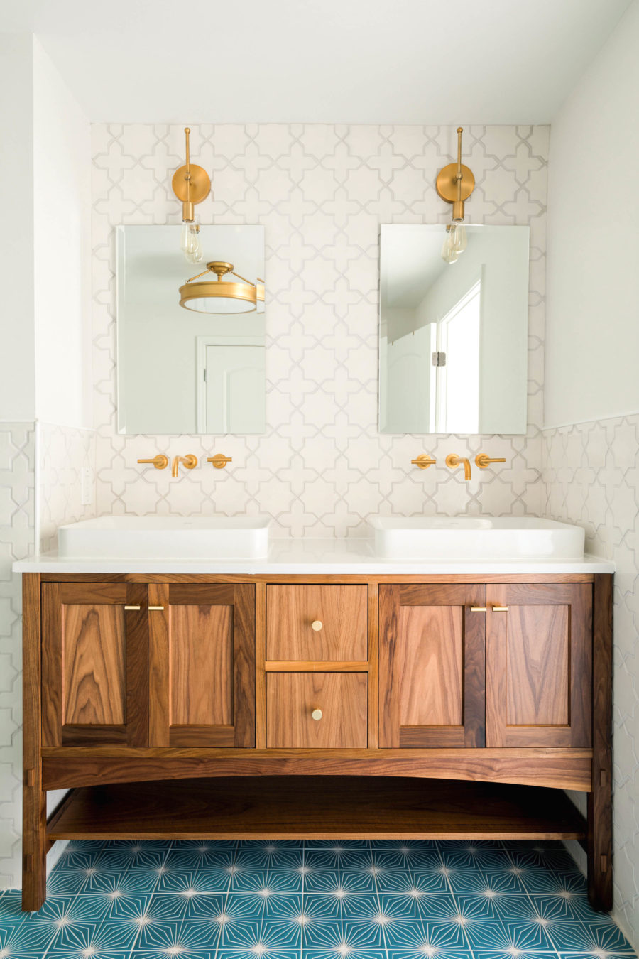
As part of our daylight basement remodel, we set apart a space for a bathroom that was adjacent to both the boys’ room and the multi-purpose room. There are no windows, but I didn’t want that to limit us from trying out color! Sharing the process behind this windlow-less bathroom renovation, and a tour today!
Bathroom Renderings
The first step to the design process was creating a design board and renderings to figure out how to best utilize the space. This is what we were able to give our contractors so everyone was on the same page with placements and measurements. This also allowed us to know what measurements we were working with when choosing products to use in the bathroom. (Will get to that below!)
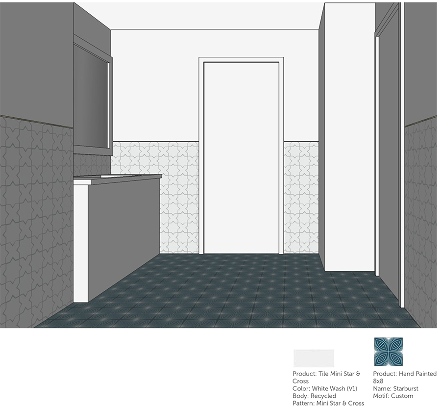
Tile Renderings
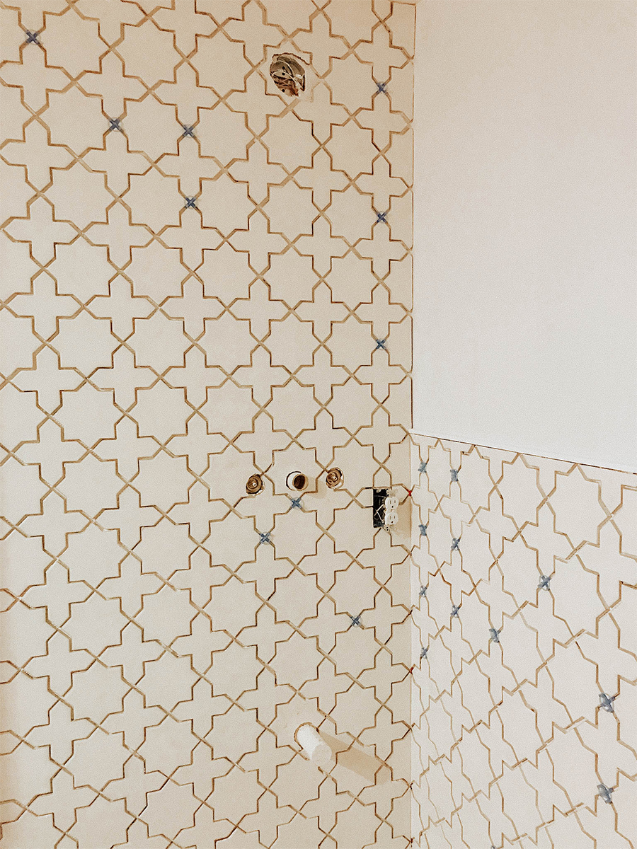
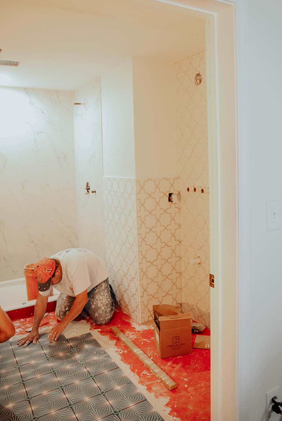
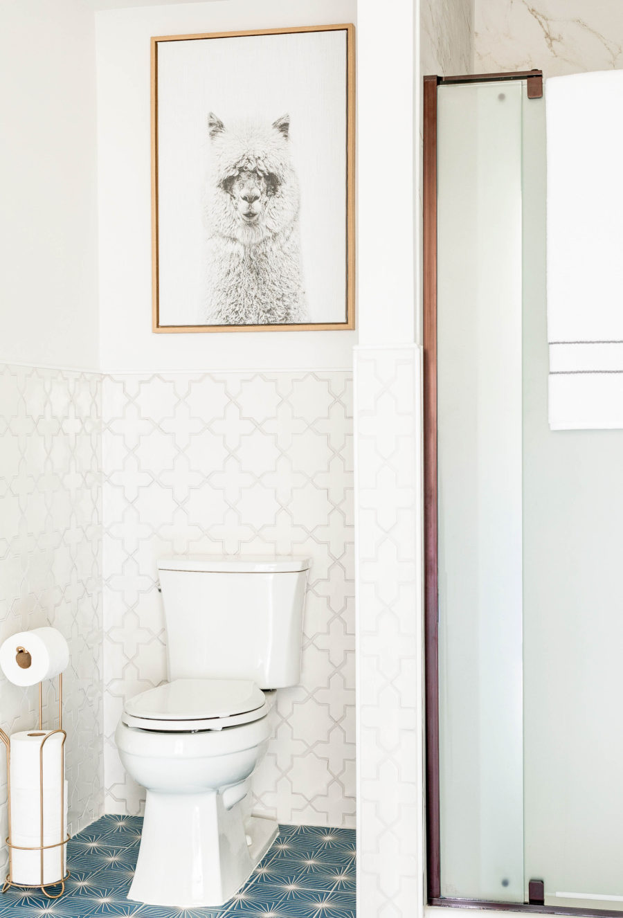
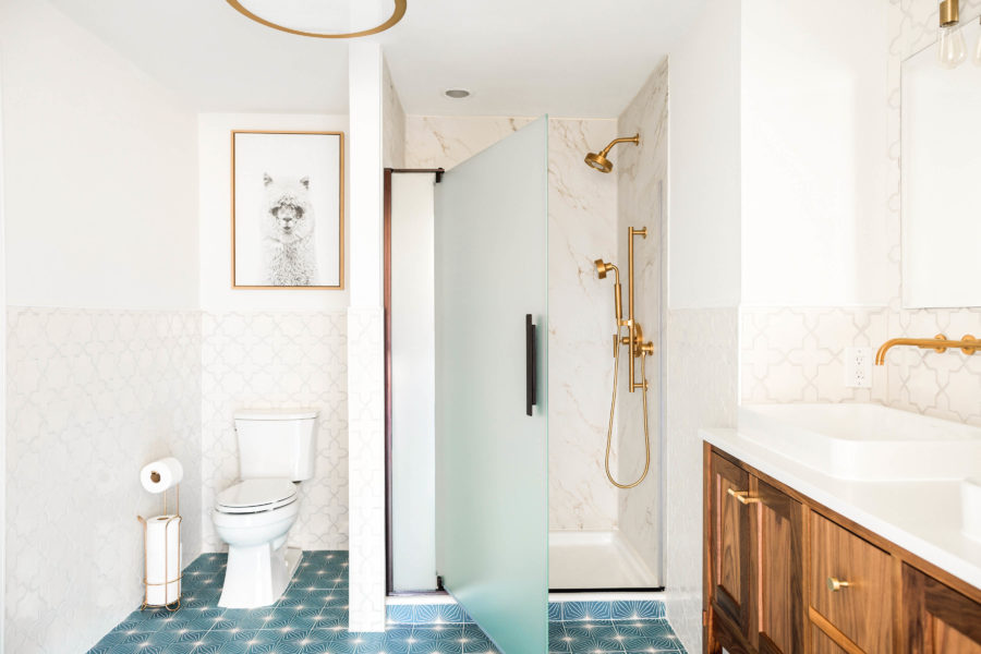
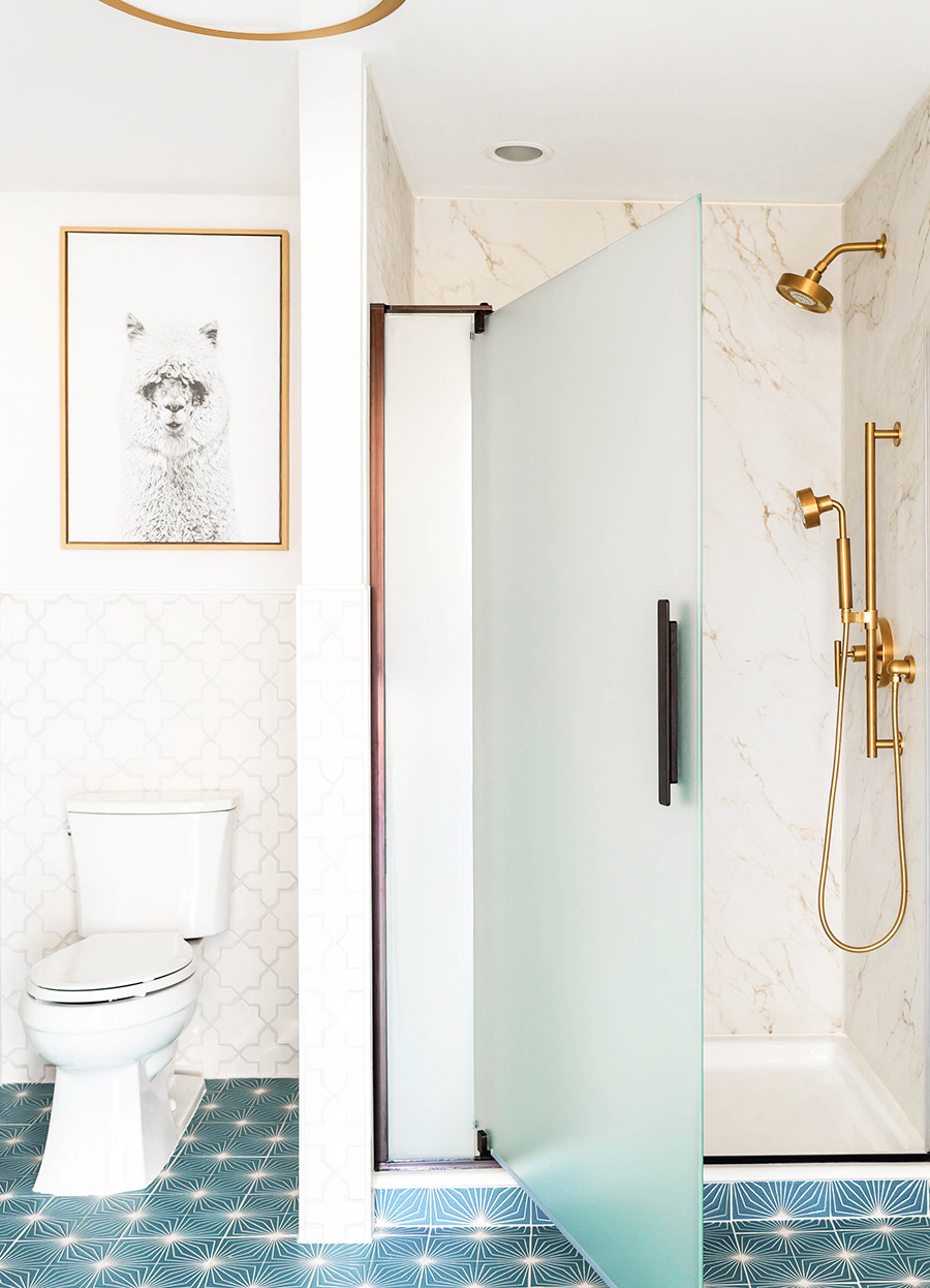
After the drywall, electric, and plumbing were set up and running, we worked with Fireclay Tile to sample and select tile in a pattern and color that would pair well with the modern/European design we were aiming for. I chose the Starburst pattern in Peacock through their custom Color-It section on their site, as well as the Star and Cross pattern in the color Tusk for the walls. The Fireclay support team is super helpful, and was able to create renderings as a test to view before committing! I loved that because I definitely thought I might mess up the decision!
To hire or not to hire for tile installation?
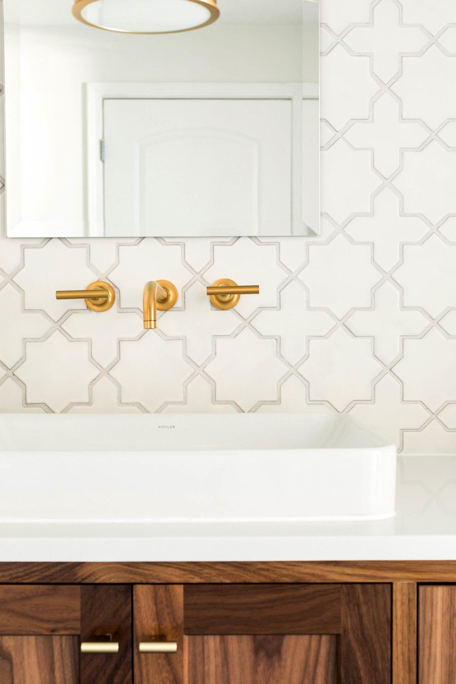
If you have wondered if tile is worth trying to install yourself or not, here’s a few things to keep in mind. Especially if your tile isn’t the standard square or rectangle shape, placing tile takes experience. You certainly could try yourself, but it takes some research to make sure floors and walls are level. Before placing tile, every surface needs to be even or tiles can warp and crack over time. We knew it would be worth hiring help for this. Gabe ended up having to fix a big patch of wall tiles due to some mistakes behind the faucets, and he learned a good deal about cutting and placing tile through the process through his own research. So if you are up for the challenge, go for it! Just know it isn’t as easy as it may seem.
Shower Kit and Purist Collection
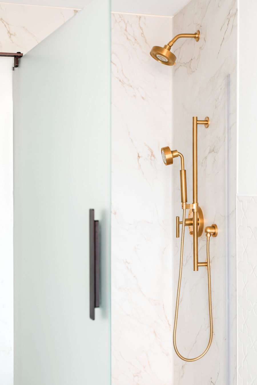
After we had the drywall, plumbing, electricity, and tile were installed (which happened over several months time), we installed the shower wall kit and base. This was such an easy, time saving alternative to tile! The standard base is not as slippery as tile can be so it was a safe option, and the wall kit came in a few finish options to glue to the dry wall. We chose an easy to open shower door option with a frosted door for privacy. Since we will have both growing kids and guests use this shower, I was excited about the handshower option that you can pull right off of the shower arm, and choose one of three spray options. I think probably most effective for post muddy soccer games;) The shower head also has water conservation options which I know will save us lots of $ in the long haul when it is in frequent use!
Cabinets, Sinks, and Faucets
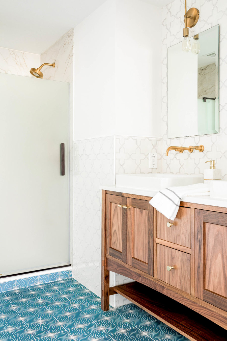
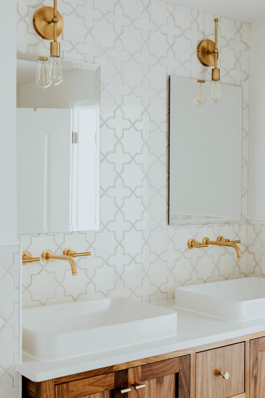
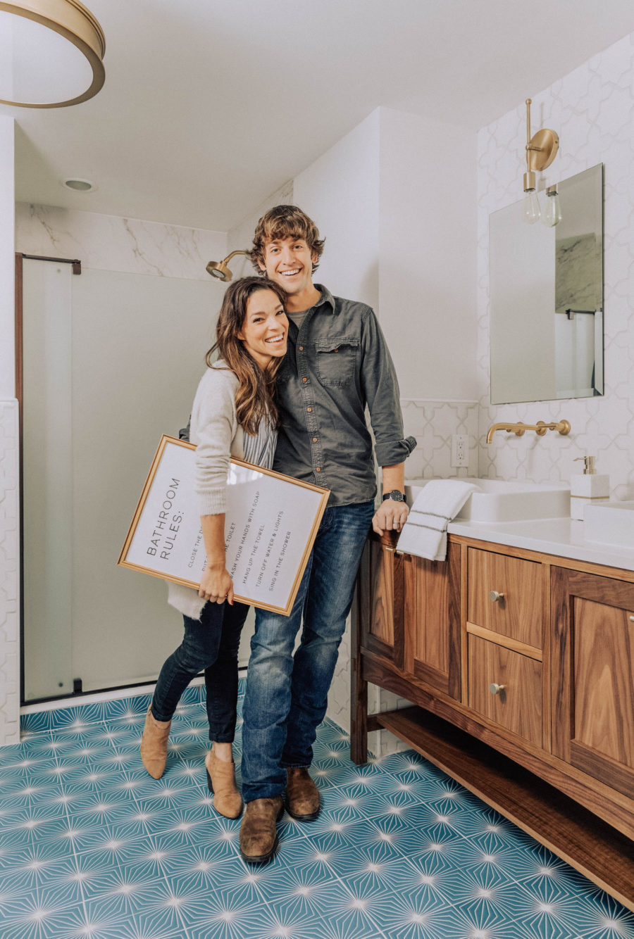
When you select a Kohler vanity, you are able to choose cabinet and vanity top variations depending on what you are looking for. We wanted to use double vessel sinks, so we had the vanity top custom cut to accommodate. The price difference isn’t much if you were to order it pre-cut or not. I ordered the hardware pulls and knobs from Schoolhouse Electric, and Gabe drilled just them in. We chose the same finish as the shower head set for these faucets extending from the wall (which we worked out with the plumber), and Gabe used special tools to drill the right sized holes through the tiles to fit them. Again, totally possible if you have the right tools and learn from someone who has done it before!
Lighting & Mirrors
I found these sconces for a steal at Bellacor lighting. Except I knew they would look better upside down! Luckily this was still easy for Gabe to figure out (he’s thankfully patient with my crazy ideas). I love the warm light edison bulbs can provide, but you can also get LED bulbs in warm tone that gets pretty close. We chose the round drum pendant to give some good even overhead light. That left us with just the mirrors to decide on. I was debating between arched and rectangle (all of you instagram friends voted arched!), and sometimes it isn’t until you hold something up and get to see it in place can you see if it will work or not. I knew there were already many line curves going on, so the frameless rectangular mirrors ended up connecting everything together more effectively. I admit I was really hoping for the arched to work!
Artwork
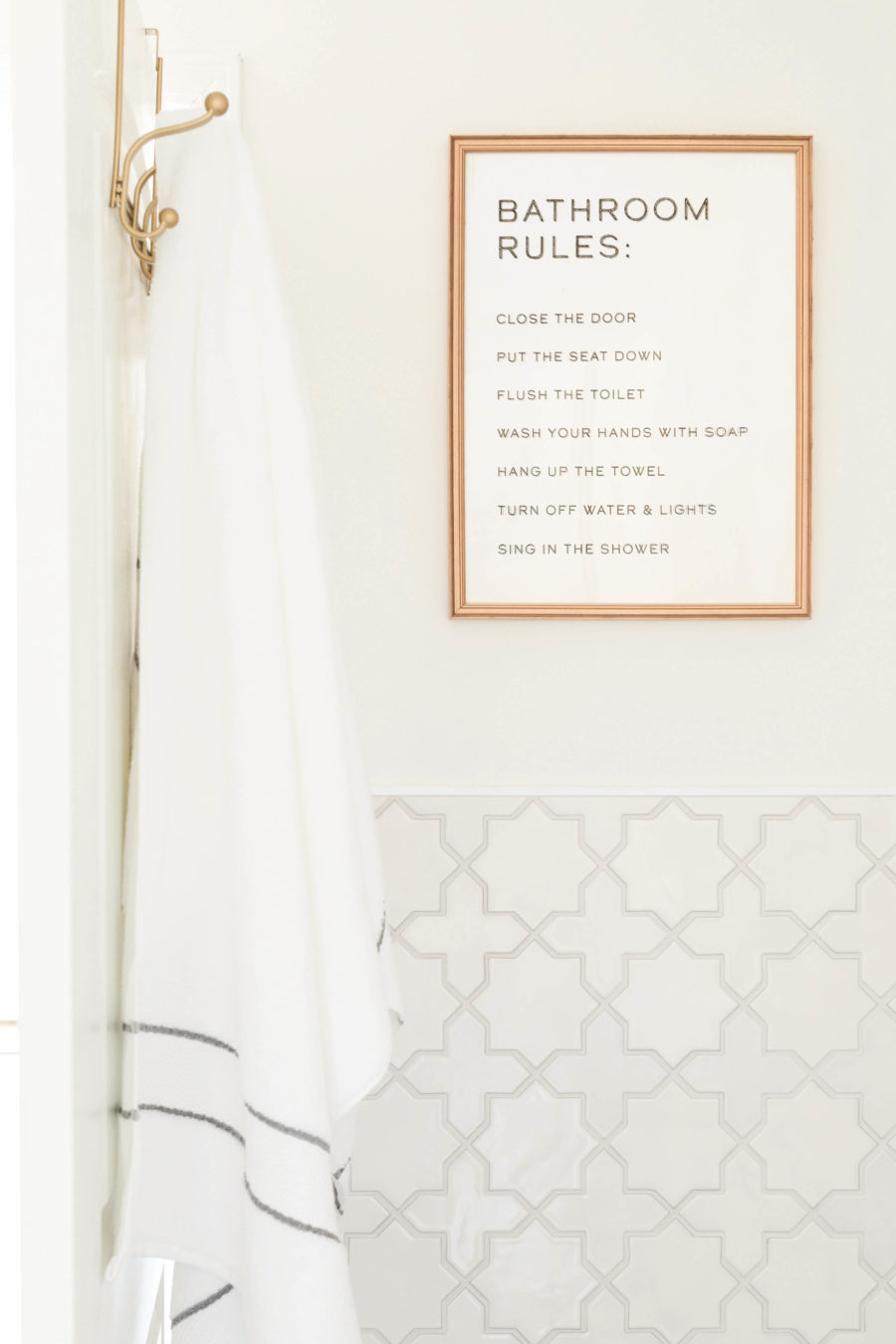
Last, but not least was some wall collateral. I was a little stumped what to use for art in the bathroom, and it wasn’t until I stumbled on the alpaca print that I knew it was the only option! I’m thinking it will ensure that my boys move it right along when there’s a line at the door. Nothing like a little intimidation, right? I also created this Bathroom Rules print facing the commode to really hammer in those guidelines;)
If we missed anything let us know! We are happy to answer any questions about this whole process in the comments below. We learned that you need a good deal of patience, persistence, and perseverence for any home design project you tackle, but especially ones where you are starting from scratch.
Sources: Purist Faucet / Vox Sink / Marabou Vanity (walnut)/ Shower Base / Choreograph Shower Walls / Shower Arm / Purist Shower Head / Purist Valve Trim / Purist Hand Shower / Slidebar/ Hose// Bathroom Rules Prrint
Tile: Starburst in the color Peacock by Fireclay Tile / Star and Cross pattern in the color Tusk by Fireclay Tile
Details: T – Pulls and Knobs/ Mirrors /Alpaca Print /Bathroom Rules / Bath towels / Soap dispenser / Toilet Paper Holder
—–
Photography by the talented Rustic White
A tremendous thank you to Kohler and Fireclay Tile for working with us on dreaming up this bathroom space!

