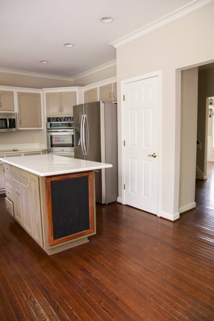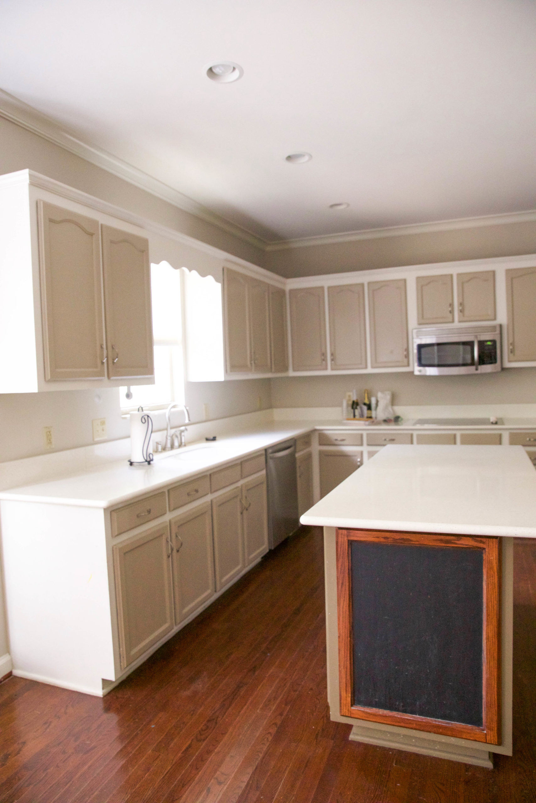
Today is the day we are starting our next big home project! We knew right going into purchasing this home, that the first big renovation project would be the kitchen!
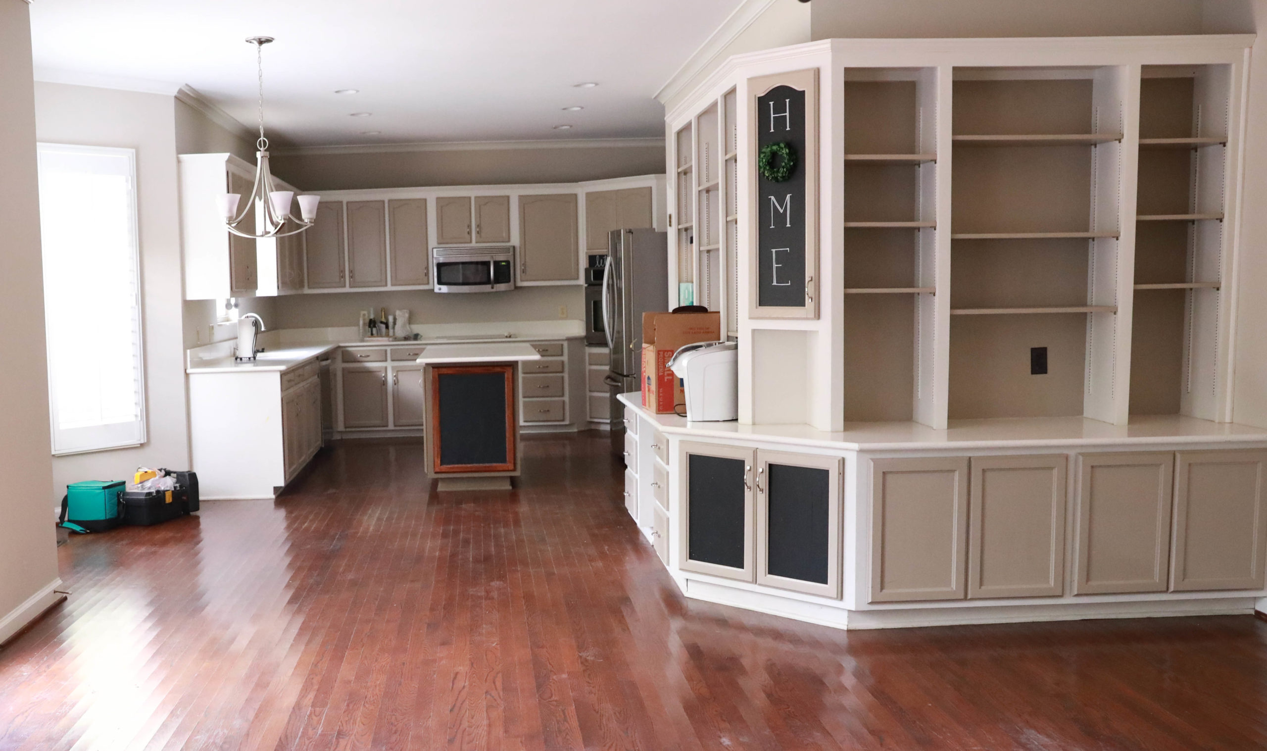
We are in the rendering phase, weighing all options with the space we are working with. We had wanted to tackle a kitchen reno in our last home, but didn’t expect to move as soon as we did. So even though this home has a different style, it is a similar layout to our last kitchen, and I have had ideas that have been brewing for years now! I can’t wait to get started. The reality with kitchens is that it takes multiple contractors, lots of time, and plenty of important measurements to consider.
I will be sharing this renovation process in phases so today, I am sharing first thoughts and design direction…
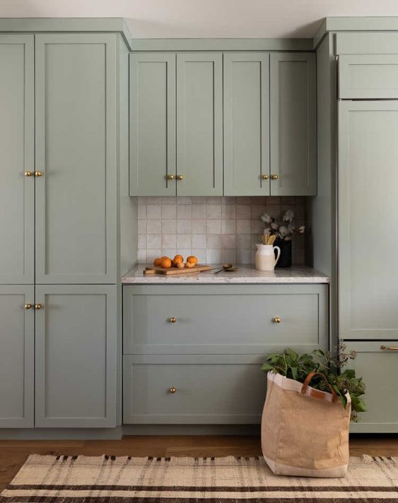
Let’s talk color first! I have it narrowed down to a few color options. Unfortunately there is only one small window in the kitchen area. While there are several windows in the eating area, direct light is slim. I love dark and moody kitchens, but am going with a light color due to the fact that I need to feel motivated to cook 178 meals a week. (You know I love to dramatize numbers.) A greige green is what I would choose if we did color. It goes well with our design direction of the new house, and is light and airy.
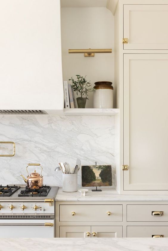
The second option is a light ivory color similar to Studio McGee’s above (Creamy White by Benjamin Moore). I love these colors with natural wood tones and antique brass finishes. Since this most likely won’t be our forever home I also think of re-sale. White and Ivory are timeless and popular colors for kitchen cabinets. I also think it would pair beautifully with a dark smokey charcoal island.Which of the two above color examples would you go for?
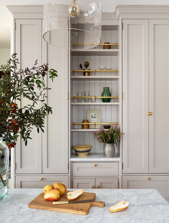
Cabinet options – We will be working with a local cabinet company on the cabinets, and currently are getting quotes on options. I love the look of open shelves, but practically speaking I would love to have more cabinet storage as well as avoid all of the dusting open shelves entail. These tall cabinets above are a great example of what I would like to do for uppers!
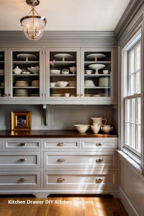
Another cabinet option I considered was glass front doors on some of the cabinets. It’s visually appealing, but only if you can keep it styled;) Soooo, I think I would rather hide all my mismatched plates and chocolate stash in solid front cabinets.
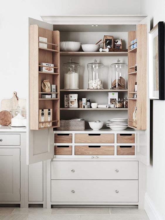
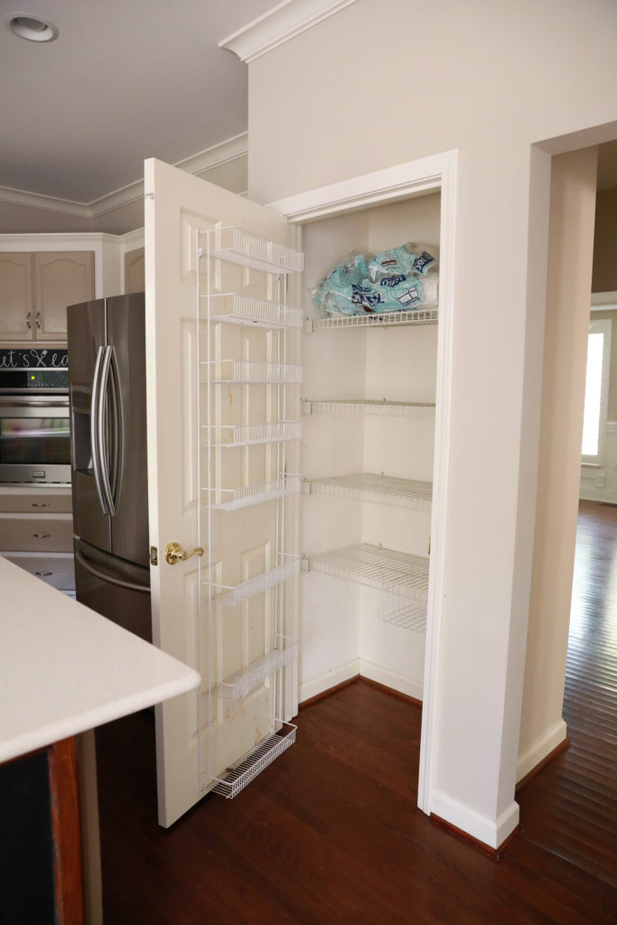
Pantry – We will be taking out the built in units to make some space for pantry cabinets like pictured above. These will be the same color and style as the kitchen cabinets!
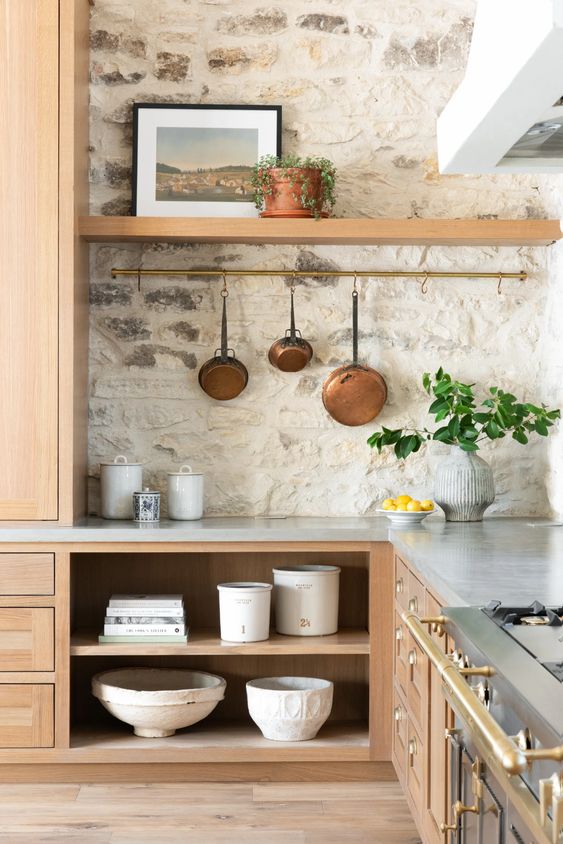
Backsplash – If I could I would just design a whole home around a French or Spanish kitchen, but even though that isn’t a reality, I can take an element or two to work with our overall goal right? The textured stone background in The Gristmill is the closest thing I can find to what I would love to achieve in the kitchen if we were going with creamy white cabinets. If we go with a lighter green I would keep it simpler.
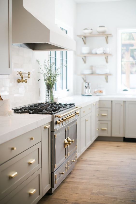
Appliances – I don’t want to spend all of our budget on appliances, but I admit I can’t stop dreaming about the one above! However, functional and cohesive with the design is all I am really hoping for! Our current fridge is too deep for the space and since we will be taking out that pantry to move food storage to the other side, I would love to consider a custom front wider fridge. The corner stove we will be moving to where the stovetop currently is in our kitchen, and cornering out the diagonal space.
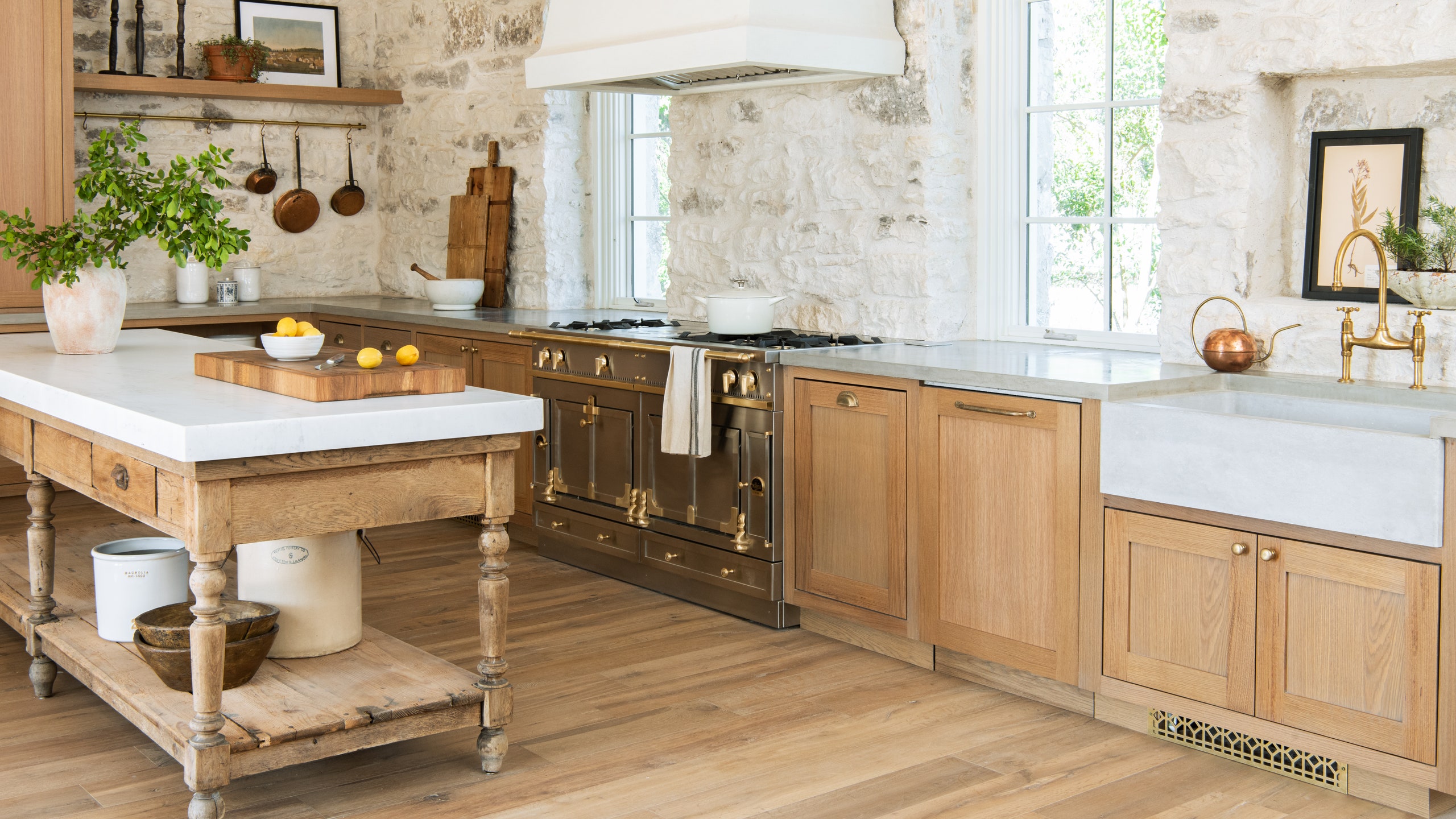
A wider view of The Gristmill kitchen. I just can’t get over that stone. I will be sure to share the kitchen renderings, budget, plans, and all of the rest as we go! Progress videos we will continue to share on instagram.
Alright, I want to hear your vote on kitchen color below!

